The summer of 1990 saw one of the world’s biggest comic book heroes hit the big screen – long before The Avengers, Wonder Woman and Spiderman. Directed by and starring Warren Beatty, Dick Tracy featured a ton of A-List star-power, including Al Pacino, Dustin Hoffman and Madonna.
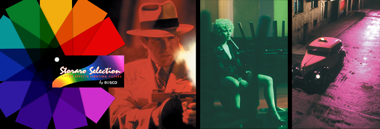
Adding star-power of his own behind the lens was Cinematographer Vittorio Storaro. The film also marked the first use of the gel colors found inside our Storaro Selection range of color filters. As the film celebrates its 30th anniversary, we thought it was a fitting time to explore how and why the colors were created.
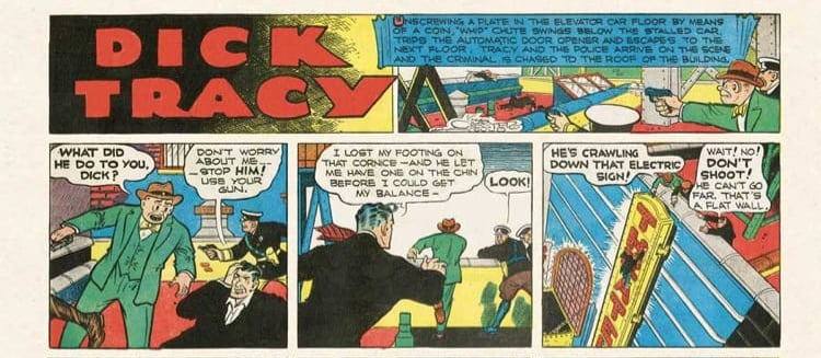
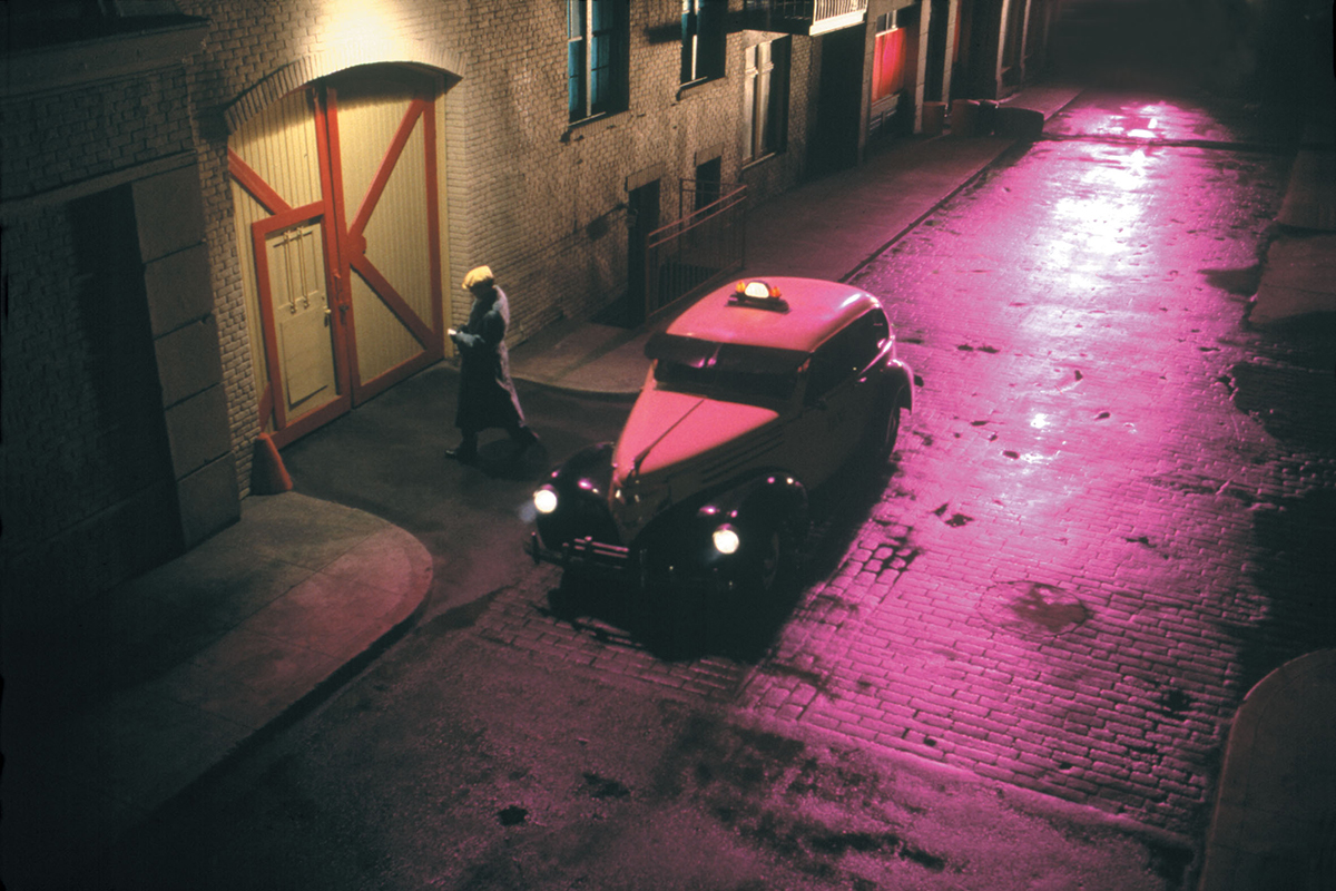
The concept of the film was based on the original color panels of the Dick Tracy comic created by legendary cartoonist Chester Gould. The original Sunday comic was a tapestry of primary colors, oftentimes featuring broad strokes of bold hues in the background. The challenge for the filmmakers was how to integrate those colors into the film.
|
|
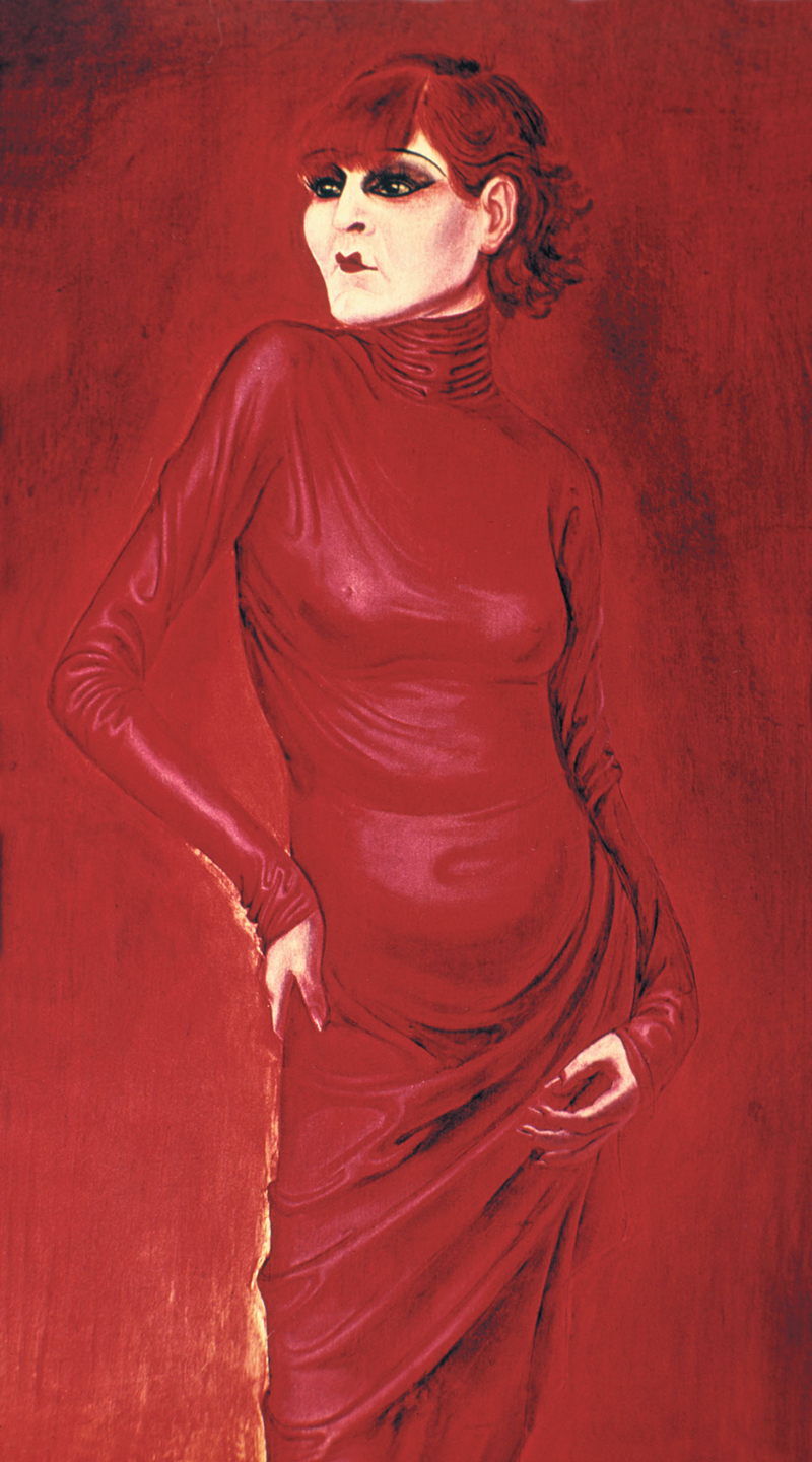
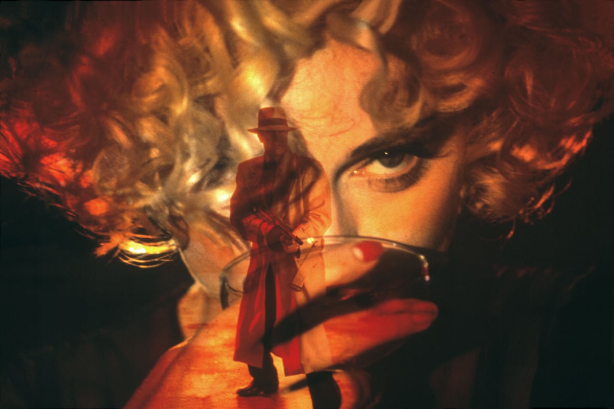
During his research for the film Storaro noted After shooting Apocalypse Now, Storaro desired a stronger understanding of color and color theory. “I was knowledgeable about the technology of cinema, but ignorant of the knowledge of art.” He wanted to learn how to use color “in a knowledgeable way,” so he took a year and researched everything he could about color and how each hue has its own meaning, its own symbolism and its own dramaturgy. “I don’t ever want to accidentally misuse a color and give the wrong information to an audience.” As the filmmakers began pre-production on Dick Tracy, Storaro had a vision for the overall color scheme of the film. His plan was to take Chester Gould’s eccentric list of characters and assign them each with their own hue. If you watch the movie with this in mind, you’ll notice that each character has a particular color scheme. |
“Each color has an energy, a specific meaning” Storaro explains. “Once you know about the different energies of the colors, you can use them to advance the story of the director. If you know the concept and meaning of the light/color – you can prepare the scene in the way you feel is most appropriate and explain why you made the choices you did.”
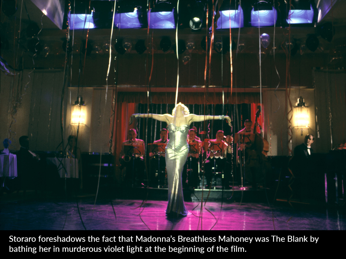
The criminal mastermind and murderer in the film is the faceless character known as The Blank. Once you know Storaro’s color-concept for the film, he actually reveals the identity of The Blank to
the audience very early in the film.
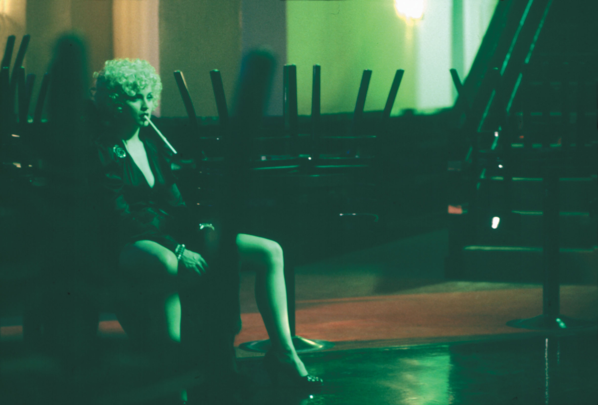
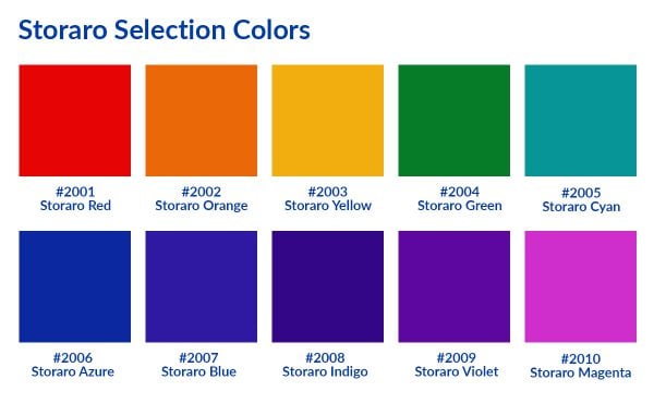
There was only one problem. When Storaro began testing for the film, he couldn’t find any of the primary gel colors he needed to achieve the color saturation for the film. He had to double-up or combine gels together. To create a yellow with the proper saturation, for example, he had to stack up three layers of existing yellow gels.
Storaro had worked with Rosco’s Stan Miller and Jim Meyer before on previous projects. He explained what he was trying to accomplish for the film and how he couldn’t find gel colors that would work. Jim and Mr. Miller went to work and, after extensive film tests with Mr. Storaro, they eventually came up with a palette of “pure” colors for the film. After the film, Stan and Jim both recognized that the bold, saturated colors created for Mr. Storaro would have a broad appeal, so they decided to add the colors to the Cinegel range of filters for filmmakers, naming them The Storaro Selection.
Throughout his career, Storaro has mastered the use of color in his work. He has come to understand that, as a cinematographer, it is important to realize that “each color has a different physiological response – emotion, heart rate, etc. – that you can use color as your own visual vocabulary.” Just as a screenwriter conveys feelings and emotions with words, cinematographers can do the same with colors and light.
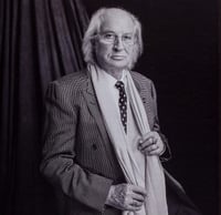
Cinematographer Vittorio Storaro, A.S.C., A.I.C. is widely known in cinematic circles as a master of light. He has been honored with three Academy Awards® for his work on Apocalypse Now, Reds and The Last Emperor, and has authored Writing with Light: Volume 1: The Light for aspiring filmmakers to learn from his experience.
The Storaro Selection is a part of Rosco's Cinegel range of color filters and diffusion/reflector materials for filmmakers. If you'd like to learn more, please visit the Cinegel product page on the Rosco website.
Joel Svendsen June 11, 2020 Questions?

Marketing Director: Joel's Rosco career began in Rosco's Hollywood office in 1999 – first in sales covering the Western US and the Los Angeles Film & Television market, and then as Product Manager for Rosco's Film & Television Products. Joel's knowledge about Rosco's products and how they're used in each of our different marketplaces makes him well suited for bringing the stories in Spectrum to life.