We have recently been asking our friends in the lighting design community to share their “Color Stories.” UK-based Lighting Designer and Rosco Ambassador Charlie Morgan Jones, who always delivers quotable tales from the stage, shares his love for the color orange in the Color Story below. Read on to learn about how bare tungsten and a colorless light plot inspired Charlie’s love for warm, orangey color palettes.
Colour. It means something so deep and personal to us all. It can trigger happiness, sadness, tiredness, and even deep memories, long forgotten. We are all forever talking about grey days, saturated sunsets, and waiting at the red traffic light. What does it mean to us?
Immediately I digress. I’ve been tasked with writing an article about my favourite colour not the exploration of colour theory - fascinating as it is!
Years ago, when I was but a whippersnapper with a 24-channel lighting desk at school, I lit Joseph and his Amazing Technicolor Dreamcoat in complete and absolute open white. Not a single gel in the rig.
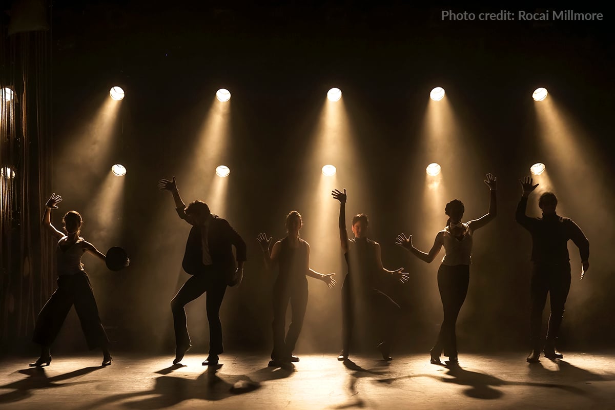 This isn’t Joseph (the photo is from, ironically enough, a production called Colored Lights) –
but this was how “UN-technicolored” it felt.
As the cast were singing about azure, fawn, olive and ochre the lights overhead remained a static, unapologetic, bold-for-the-designer’s-age open white. There may have been some poor flashing effect, if my memory serves me well, but at the time I was also worrying about the Year-9 exams, so my mind might be lying and trying desperately to make up for – what the press called [probably] “the greatest lighting faux pas at the Cathedral School in Llandaff in all eternity… ever.”
 “Stop rambling,” my reader of one yelps!
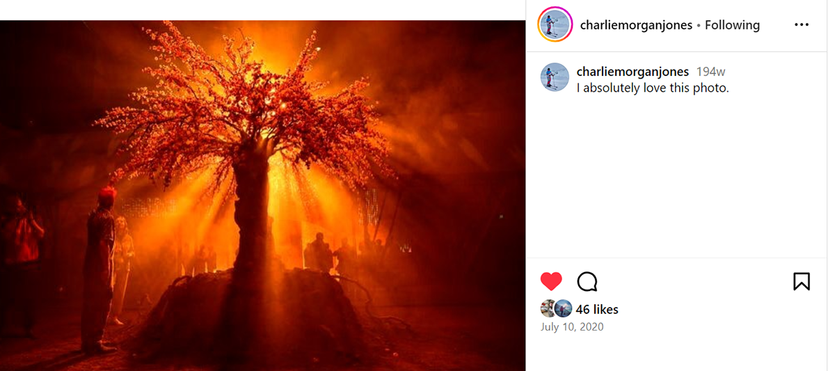
Tungsten, and that show, led me to my love of orange. The more tangerine, the better. Musky, terracotta hues. Dark and sultry rusts. Earthy, woody tones. I love them all.
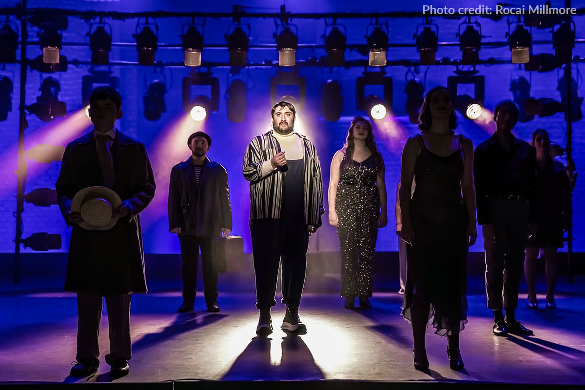 The contrast of warm tungsten with a deep blue = my favourite colour combination.
But there’s nothing greater than the dim orange glow of an uncoloured PAR Can. That deep saturation, like campfire light in the middle of the forest, or a lonely lantern attached to a carriage riding across an open road. I always thought blue lighting was my ‘thing’ – and I do adore it – but what’s saturated blue without the punctuation of tungsten? No depth, no sculpture, no nothing.
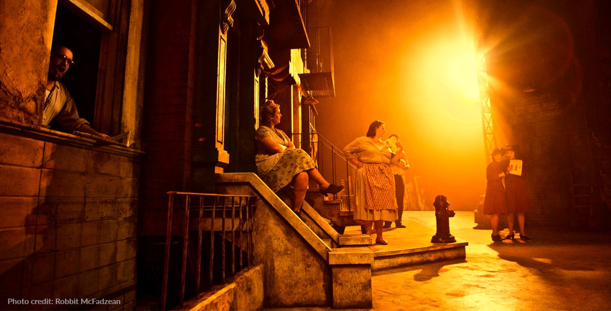
In 2017 I was lucky enough to light Street Scene in Glasgow with Superb Director Alexandra Spencer-Jones and Scenic Designer Adrian Linford who had constructed a set that stretched – like a full New York City block – from downstage right to upstage left.
The piece is set on the two hottest days that New York had ever felt in 1946, and I remember my initial gut reaction of how the lights should look:
5kW fresnels – which already glow orange, warm, and delightfully tungsten – with some saturated orange gels added. The overall effect needed to be “sweat and oppressive heat thumping down on you.”
I remember my family came to the opening night and my Aunty Wynne said that you could literally feel how hot it was when the curtain flew out. Mission accomplished.
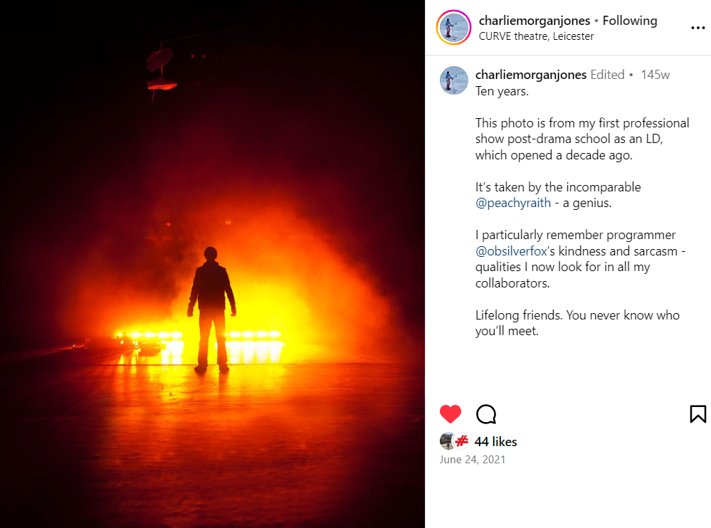
I’ve always been more comfortable with warm palettes than cold - maybe my mission for the future should be to experiment more. And please - someone let me have a do-over on Joseph and force me to add some colour this time!!!
Unfortunately, the next UK production of Joseph has already hired its lighting designer, but we’re sure we’ll get to experience the warmth of Charlie’s lighting design in something equally fantastic very soon. If you’d like to see more examples of Charlie Morgan Jones’ work, visit his website: charliemjones.co.uk, or follow @charliemorganjones on Instagram. If you’d like to explore all of our orange-colored Rosco gels (and the other colors too) – download our new myColor Mobile App.

