

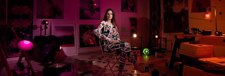
Venezuelan Photographer Pedro Wazzan tagged Rosco in a series of posts on his Instagram account that featured portraits of artists living in Miami bathed in rich, saturated color. His photographic project includes artists in their studios or workspaces at the Bakehouse Art Complex, who are surrounded by their supplies, materials, and their finished and unfinished work. Pedro explains below how he chose colors specific to the artist’s work and how instrumental the Rosco Filter Kits have been on this project.
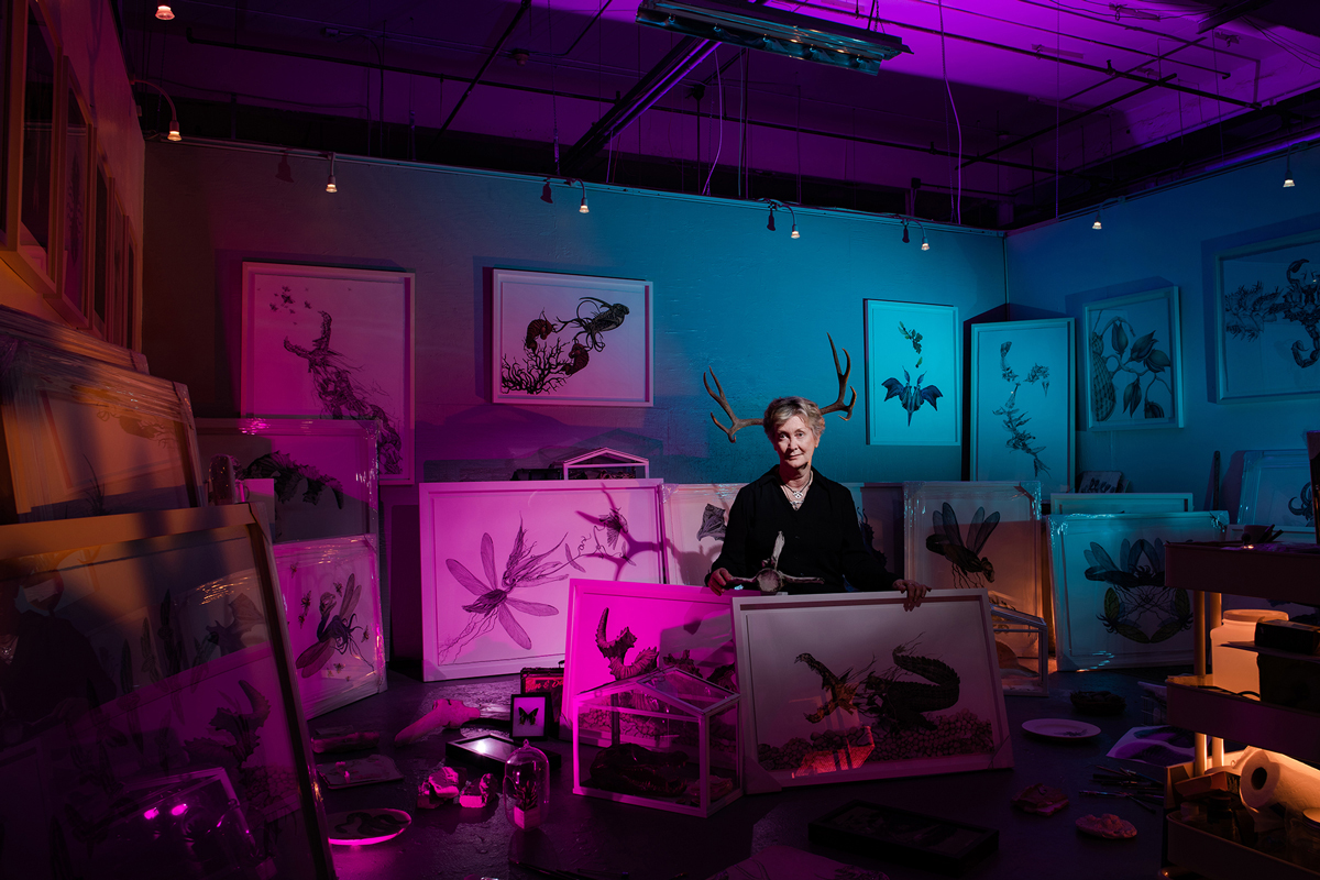 For these portraits, I used between six and eight speedlites, two 600-watt flashes, and two or three practical lights. All of the colors and textures in the shots were created by mixing Rosco CalColor filters with filters from the Rosco Color Correction Filter Kit and the Rosco Diffusion Filter Kit.
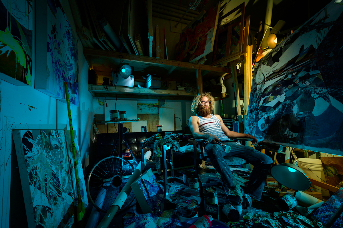 Many of the shots have a practical, incandescent light bulb in the frame. I set my exposure for the ambiance of those 75-watt bulbs so that the illuminated bulb is in the shot with the correct exposure. From there, I filled the scene with light and color using my speedlites, flashes, and gels until I had a dramatic look in the scene. Using tethering, I began to shoot as I checked the developing scene on my computer monitor, then I made changes until I saw the image that I had created in my mind.
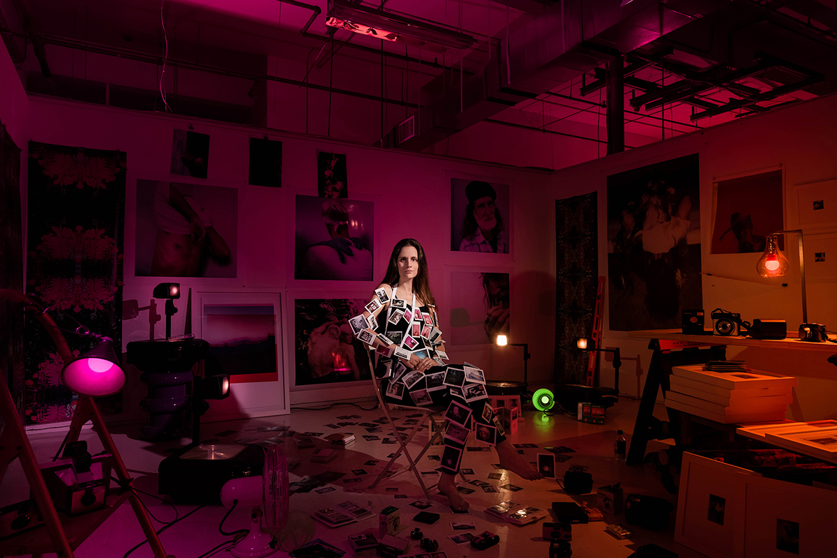 The palette of colors I used in these photographs were related to the work of the artists. I tried to create color schemes using secondary and complementary colors, as well as other mixes that were more experimental. I also played with the white balance in order to obtain a new color mix from the gels and the ambiance. Mixing Rosco CalColor filters gave me an infinite world of color that enabled me to create the narrative I wanted while showcasing the personality and characteristics of each artist.
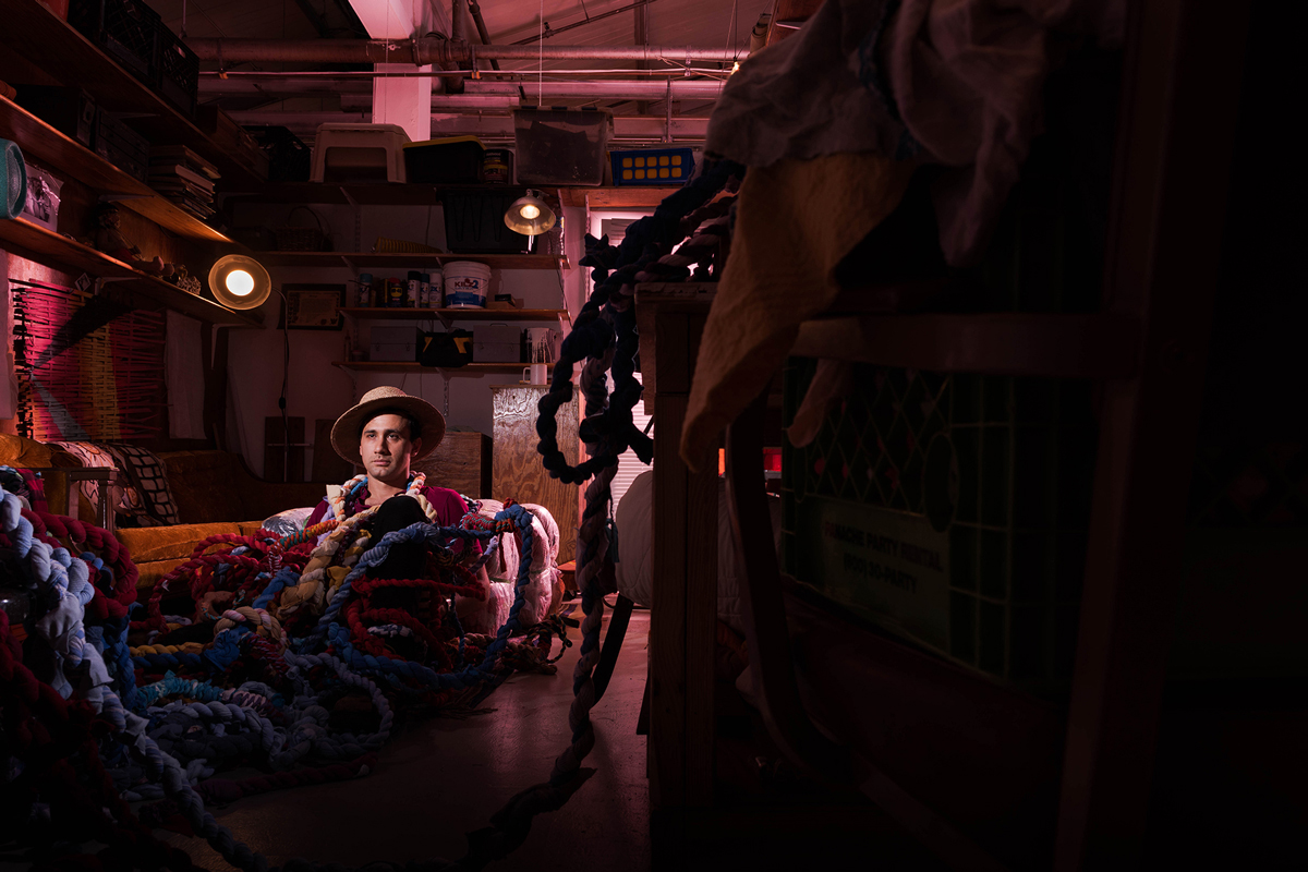 The Rosco Diffusion Kit was instrumental in the making of these portraits. On the camera, I used the “Vivid Native” setting because of its contrast and saturation of color. The Rosco Diffusion Filters inside the kit helped me to control the contrast levels. I mostly used the Tough White diffusion series: R3026 Tough White Diffusion, R3027 1/2 Tough White Diffusion, and R3028 1/4 Tough White Diffusion.
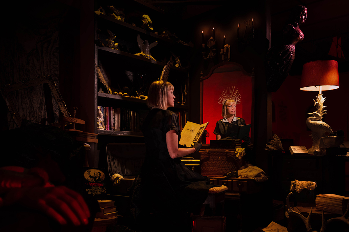 I also use the Rosco Color Correction Kit on almost every project I shoot. Every time I prepare a scene for a photo shoot, I use the filters in the kit to adjust the color temperature of the lights based on my white balance. This technique allows me to deliver my client the best of the best, while also saving me time in my editing workflow.
 To see more of Pedro’s work, make sure to follow @pedrowazzan on Instagram or visit his website: pedrowazzan.com. If you’d like to learn more about the gel kits Pedro used, visit the Filter Kit Product Page on the Rosco website.
Cara Donohue October 15, 2019 Questions?

Cara Donohue is the owner of Twist Agency, a social media marketing firm that was founded on the basic principles of freshness and creativity, with a way outside-of-the-box mentality. Cara has been cutting through the clutter of social media for almost ten years, using storytelling to humanize each brand she works with. Her content development portfolio includes doctors, lawyers, lifestyle products, e-commerce and most recently the entertainment industry.