

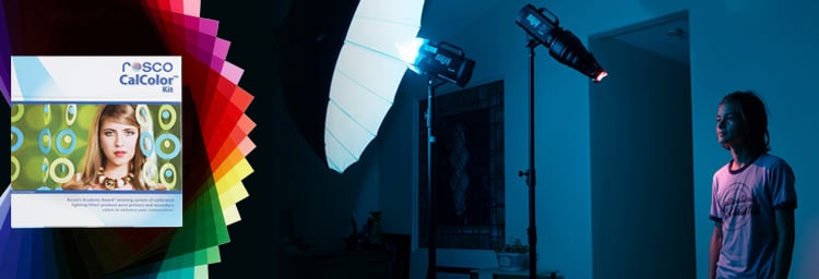
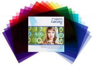
 The CalColor Filter Kit, featuring cover art from Hernan Rodriguez
When it comes to using our Academy Award®- winning CalColor filter system to enhance the lighting in portrait photography, Hernan Rodriguez would definitely be considered an expert. Taking inspiration from his experience as a painter, Hernan uses the calibrated primary and secondary CalColor hues in almost every portrait he shoots – including the image we’re using on the cover of our CalColor Filter Kit and CalColor Flash Pack. Below, Hernan Rodriguez shares how he uses the color-mixing physics behind the CalColor system to turn ordinary white walls into interesting colored backdrops.
As photographers, we are expected to create spectacular portraits in very ordinary locations. Most of the time, we are set up in some white room like an office or a home interior. Whether I’m photographing Snoop Dog, Mario Lopez, Evander Holyfield, or an up and coming actor, I rely heavily on my lighting techniques to customize the emotion of the portrait with added color. Specifically, I frequently use the CalColor filter system to create more provocative portraits when shooting against a standard white wall.
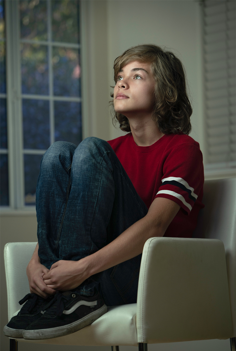
 In this example I worked with a very gifted young actor named Arman Darbo, who has already landed a few movie roles. I did not want to shoot him using a fabric backdrop or paper roll. I wanted to create something less contrived in a natural setting. I wardrobe him in jeans, retro bowler’s top and his vans. My objective was to create drama with his posing and expressions. My home studio was just painted white, so there was not much there to work with. On the bright side, it did lend itself to a high-key portrait, which would capitalize on his individuality. In the examples below I will demonstrate how I used CalColor Filters to transform ordinary photo to an extraordinary portrait by using CalColor.
For the first setup I placed a white chair in front of a window, where two white walls joined. I really thought a bit on how I would create something special for Arman. The window was not interesting at all, and outside were some bushes and green foliage. I started with choosing the proper light modifier, which needed to have a sense of balance with the lighting outdoors. I choose a white deep umbrella made by Westcott, which focused the light a bit, but still had a soft quality to it. That was it for lighting. From there, I used CalColor and custom white-balance settings to colorize the portrait.
STEP 1 – I placed sheet of CalColor #4530 30 Yellow on my strobe and shot a gray card that filled the entire frame. I found the one-stop, 30 Yellow provided the best balance of color for my key light. One point to consider is that a stronger density filter, such the three-stop 90 Yellow (#4590), would have a more dramatic effect on the color.
 STEP 2 – I set a custom white balance to the CalColor 30 Yellow hue. From the custom white balance menu on the camera, select the image of the gray card lit in the #4530 to set the camera’s white balance. Once this is done, anything lit in 30 Yellow will render as a neutral “white-light” because the camera has added the opposite color – in this case blue – to neutralize it. Wherever the CalColor Yellow light strikes will appear as “normal,” and wherever it doesn’t will now render as blue.
You’ll see that the warm white wall now has a blue tint and the foliage outside the window, which was much brighter than the wall, is now a dappled blue. It almost looks like Wisteria outside, with a Monet type of appeal.
PRO-TIP: Make certain there isn’t any natural white light striking your subject as this could cancel out the effect. You can, however, use that natural light behind your subject as an added effect as it would, in this case, render as blue accent lighting.
EXPOSURE: I first took an ambient reading for the outdoor exposure, so I could balance the amount of flash for my subject. This exposure was 125th of a second at f/5.6. Now I set the power on the flash to meter f/5.6. I am sure some of the hot spots outdoors registered over f/8, which created added interest.
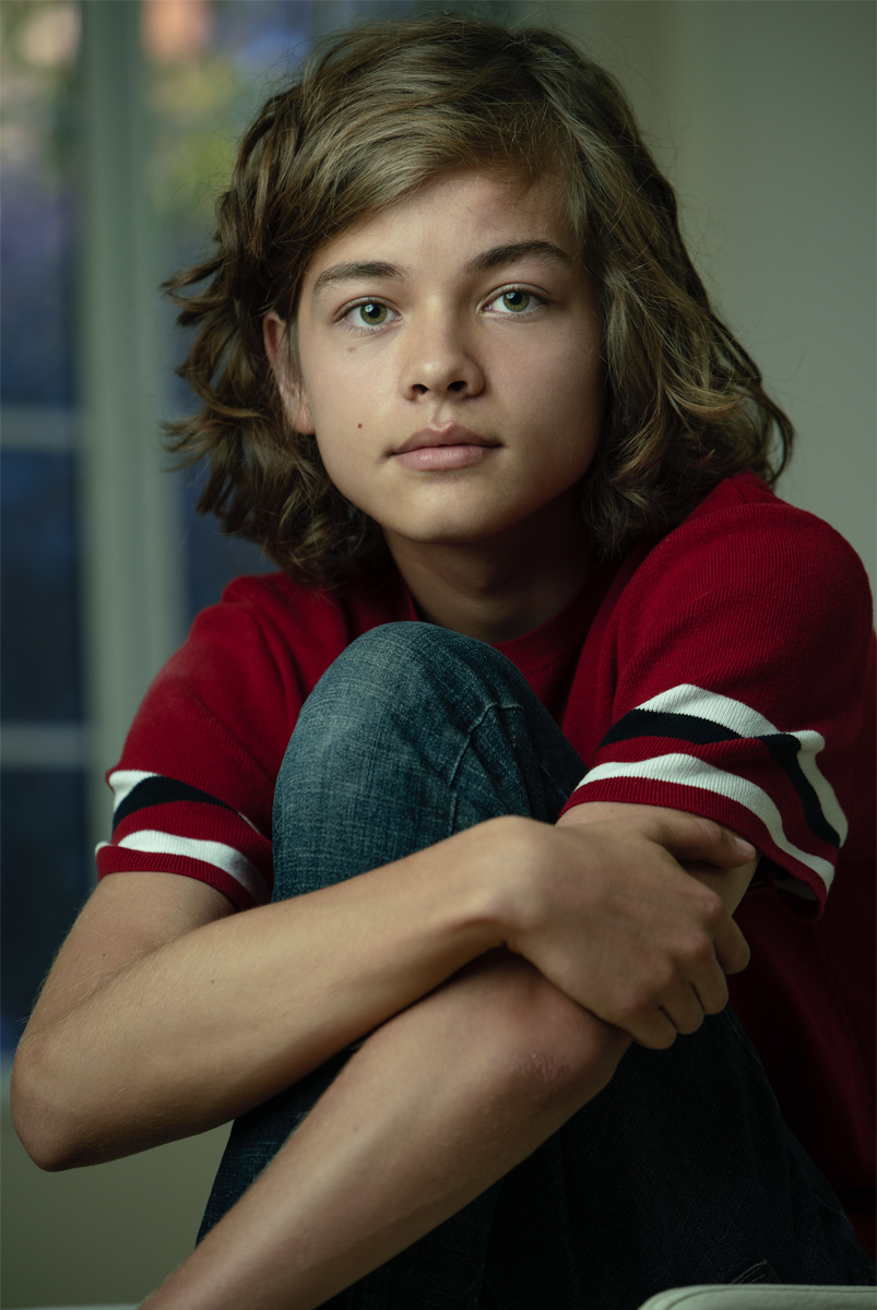
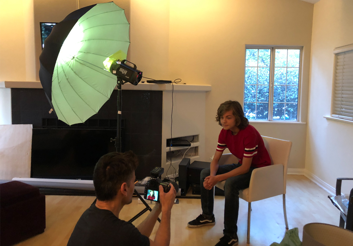
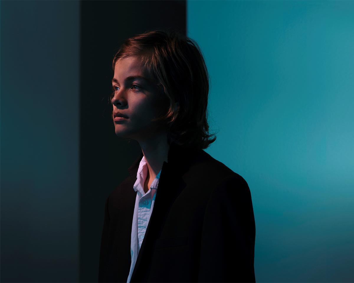 For the second setup, I had Arman step in front of a narrow hallway with two adjacent white walls. I wanted to create something much bolder and edgier. To create a youthful, semi-casual look for Arman, I chose a black tuxedo jacket with a white loose fit button-down shirt. The lighting was very important for this shot, so again, I decided to select the right type of modifier to create the look I wanted. For my key light I used a Dynalite Baja with a snoot, which created a very focused light just on his face and rendered most of the scene black. This is a creative way to turn white walls into dark gray or black. I then placed a second flash with a white deep umbrella as my fill.
STEP 1 – Set a custom white balance without any color on the strobes. Using the same process as Step 2 in the first setup, shoot a gray card without any color on the strobes to set the “room tone,” then use that photo to set your custom white balance.
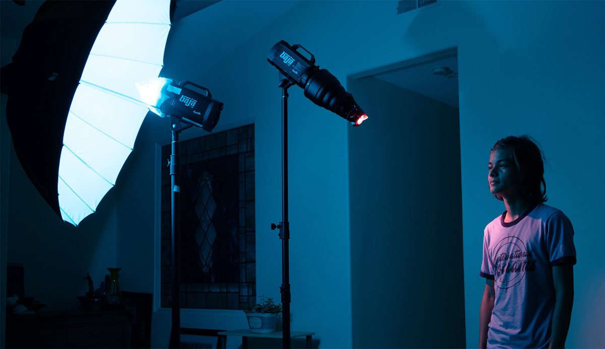
STEP 2 – Once your customized white balance has been established, you are ready to add in the CalColor filters. In this setup, I used two opposing hues: Red and Cyan. A piece of CalColor #4690 90 Red is covering the snooted key light. Because the 90 Red has a density value of 3 stops, I had to make certain I had enough flash power to make up for the loss of light shooting through the filter. I took a test shot with only the key light and metered to an f/8.
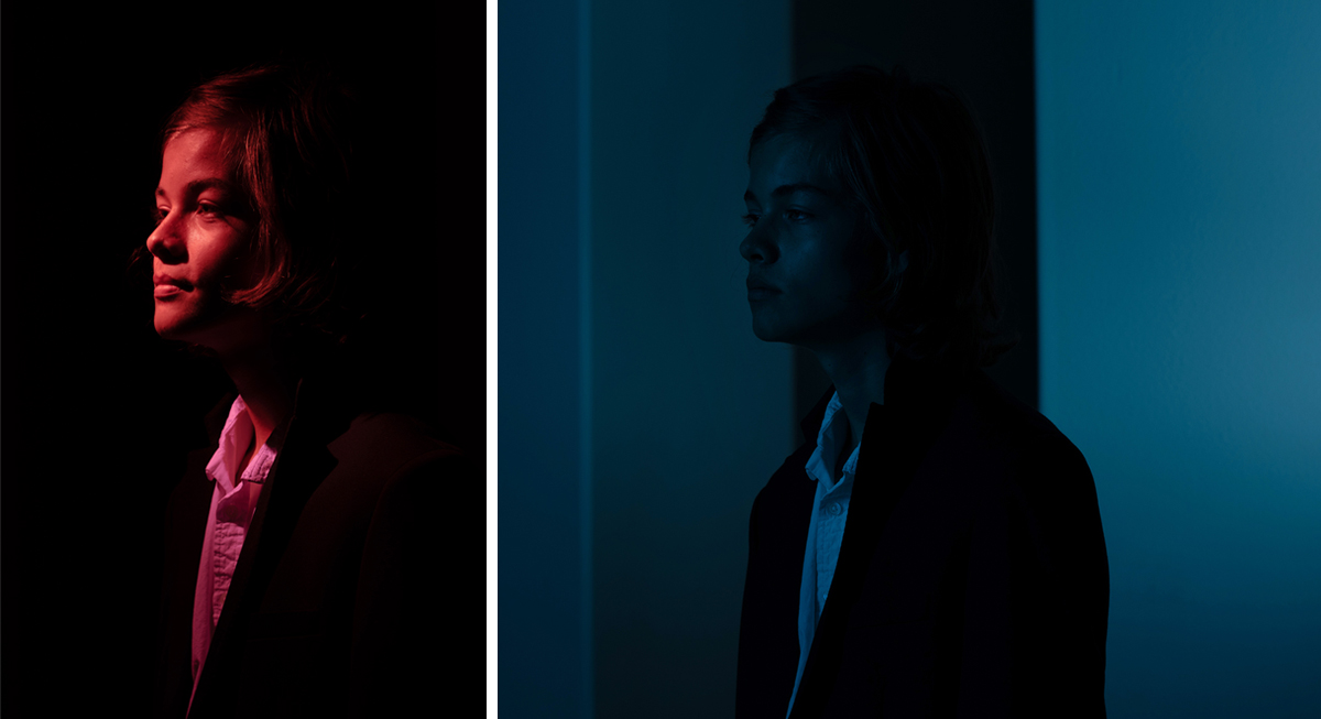 Arman lit solely with the CalColor Red snooted key light (L) and the CalColor Cyan fill light (R)
STEP 3 – Next, the opposite, or complementary, color is placed on the fill light. I used CalColor #4390 90 Cyan on the strobe aimed at the umbrella. I took a test shot with just the fill light and metered this light to f/4. I loved how this light filled the shot with soft, even, Cyan illumination – knowing that I’d be able to balance the Cyan out of the skin tones with the CalColor Red key light.
STEP 4 – The final step was to take a meter reading with both lights on, and to make any adjustments needed to your lights. I adjusted the position of my fill light to be directly behind my key light, which created a more natural effect. My final meter reading with both lights on was an f/9.
 Here is the final shot again. Notice how natural the skin tones are where the two complementary-colored beams overlap each other? The Cyan/Red combination created a natural tone of light with a slight tint of Red because the snooted key light was just a little brighter than the Cyan fill light.
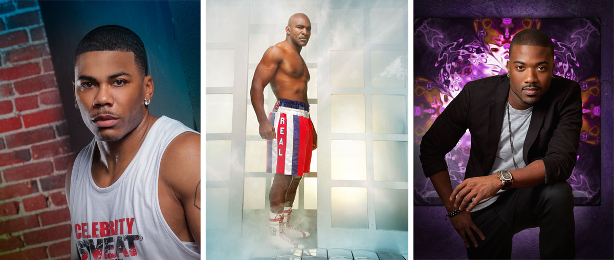 Hernan Rodriguez portraits of Nelly, Evander Holyfield and Ray J - all shot with CalColor Filters
I often get asked why I use CalColor if, in the end, I am neutralizing the color to create “white light” on my subject? My answer is simple; now I have color that is recorded “in-capture” that I can manipulate later in post-production to create moods and undertones for my portraits. You’ll also find that the CalColor filters also align well with the RGB & CMY adjustment tools you’ll use in post. This is because CalColor was engineered for the camera. In fact, the “C-A-L” of CalColor stands for “calibrated,” which means they will predictably render as pure primary (Red, Green, Blue) and secondary (Cyan, Yellow, Magenta) on camera. My best advice is to practice, practice and practice some more. The more you practice, the more you’ll begin to see how many combinations and variations there are for fantastic, in-camera results that you can push into spectacular imagery.
 To see more of Hernan’s spectacular work, be sure to visit his website: www.hernanphotography.com, or follow him on Instagram @hrodriguezphotos.
If you would like to begin practicing with the filters and techniques Hernan described in this blog, be sure to explore the 12”x12” CalColor Filter Kit, or the speedlight-sized CalColor Flash Pack – available wherever Rosco color filters are sold.
Joel Svendsen August 15, 2018 Questions?

Marketing Director: Joel's Rosco career began in Rosco's Hollywood office in 1999 – first in sales covering the Western US and the Los Angeles Film & Television market, and then as Product Manager for Rosco's Film & Television Products. Joel's knowledge about Rosco's products and how they're used in each of our different marketplaces makes him well suited for bringing the stories in Spectrum to life.