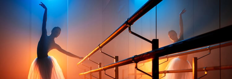
Photographer/Director Alexis Cuarezma tagged us in a photo on Instagram that made our jaws drop. He had recently concluded a photo shoot with Principal Ballerina Christine Shevchenko that showcased his photographic lighting technique using different white balance levels and Rosco Color Filters.
Inspired by his photo, we reached out to Alexis and asked him if he’d be willing to share his approach to lighting this shoot. In response, he provided us with the video and descriptions below.
I love having color contrast in my images, which is why I use a lot of complementary colors. When it comes to lighting, I love combining warm and cool tones. One of the questions I get asked most often is if I use blue gels? And the answer is, VERY RARELY.
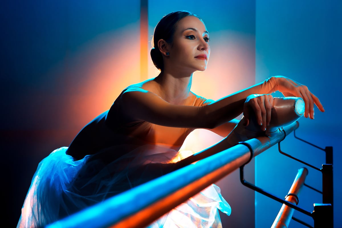 What I much prefer to do is set the color temperature of my camera between 2500K-3500K. By doing that, any light from a daylight-balanced strobe in the shot will appear blue. Any warmth that I want to bring into the images I create with a combination of CTO (Color Tint Orange) and CTS (Color Tint Straw) gels from Rosco.
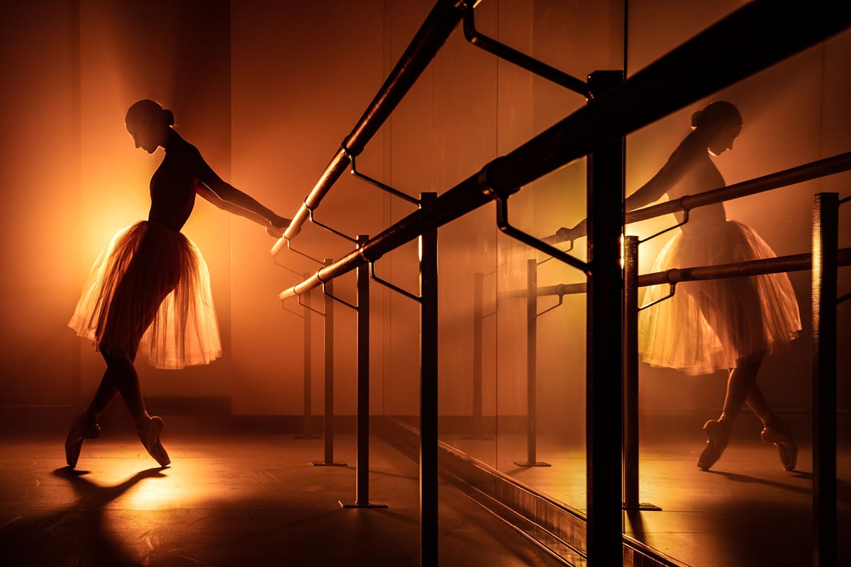 Even when I want to go for a monochromatic look, and just want a singular gold tone, I rarely just do that in camera with the white balance. I prefer to gel the lights. I find that using a combination of CTO/CTS gels gives me the warmth and the gold tone that I want.
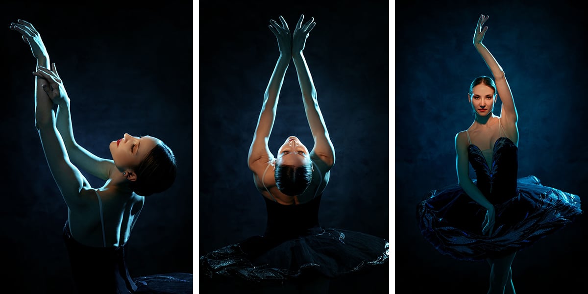 When I want a little less color contrast, I’ll shift my white balance to anywhere between 3500K and maybe 4000K, and I'll gel the light depending on the mood I want. The three photos above, for example, are much more subtle than the previous photos that I shot at 2500K and a saturated combination of CTO/CTS gels.
I was inspired by a previous portrait I had shot for an artist named Hueman. As we were walking into the dance studio, I noticed a wall that had red and white stripes and it reminded me of the colored wall in the background of the Hueman image. I wanted to create something similar that didn't have any white in it at all – just color purely for impact.
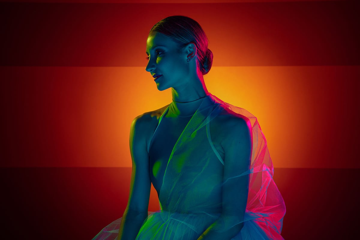 To eliminate all of the white on the wall in the dance studio, I put a light behind Christine that had a Dynalite Honeycomb grid and a saturated combination of CTO/CTS. I also had a light with no gel on it to bring out the red stripes. One of the lights illuminating Christine had a Rosco #3202 Full CTB (Color Tint Blue) to add some blue from underneath, while the lights on the sides lit her with Rosco #89 Moss Green from the left and Rosco CalColor #4760 60 Magenta from the right.
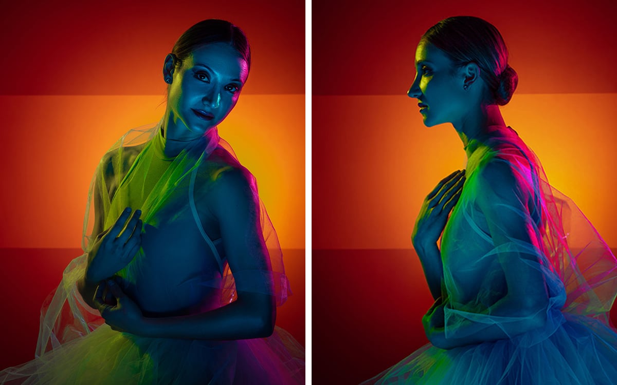 I absolutely love lighting. It is essential to how I create my images, and I find that adding color to my light using Rosco Color Filters helps amplify the emotion and the mood that I want to evoke in my photography.
Be sure to watch “Destined For Greatness” below. It's a 30-second short film shot by Alexis that describes the journey Christine Shevchenko took to become a principal dancer at the American Ballet Theatre in New York. To see more of Alexis’ work, be sure to follow him on Instagram. If you’d like to experiment with the lighting filters that Alexis used to create the bold and saturated colors seen in this photo shoot, explore the range of Filter Kits and Flash Packs on the Rosco website.

