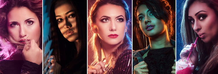
Originally from Germany, Photographer, Sandy Dee, studied Photography in London before moving to San Jose, California where she runs stylized portrait workshops, and wrote the book “Posing like a Pro - The Photography Guide to Creating Your Best Portraits Ever!” We discovered Sandy – and how much she loves teaching and helping photographers discover new techniques – when she began tagging Rosco in her Instagram posts. Below, you’ll find excerpts from one of her recent blog posts explaining how her love for television influenced her colorful photographic lighting setups.
Like so many kids, I heard this a loooooot in my childhood: “Don’t watch so much TV!” My parents grew even more skeptical of my behavior when I would also study the TV magazines over and over. But that was the 90’s - we didn’t have internet, mobile phones, and IMDB trivia yet, so magazines were the only way to get more information about your favorite TV shows.
What my parents didn’t understand was that I never just watched a show. I was actively involved in the shows that I loved. I let myself get pulled into those shows by thinking about the writing, analyzing the lighting and the atmosphere and examining how it all combined to create the style, color scheme and overall feel of the show. What I found even more interesting was how the combination of all those design elements made ME feel. Years of analyzing my beloved TV shows influenced my photography. I didn’t want to be just a photographer. I wanted to tell stories - cinematic stories – and I am able to tell those stories in my work.
My latest inspiration was Riverdale on The CW, and I recommend that every portrait photographer watch it - at least ONE episode. Yes, it’s a show about teenagers, and maybe you won’t like the story, and you might not consider it to be “art,” but when you look a little closer, the stylistic devices in this show are simply stunning. It’s modern, yet slightly nostalgic. The kids meet up in the local 50’s diner and their wardrobe somehow reflects this time period without being noticeably “old-fashioned” – and the lighting is just amazing.
Needless to say, the moment I saw the promo images for the show I wanted to create something similar. I began by analyzing the “key ingredients” I would need to achieve a similar result. I didn’t have access to a diner or the same neon sign, so I had to somehow “fake” the look in my photo studio. All I needed was a wet sheet of plexiglass, some kind of sign to add some interest 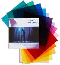 to my background and, most importantly, some colored gels for my lights.
For me, the best gels come inside Rosco’s Color Effects Filter Kit, which contains 15, thin, 12” x 12" sheets for around $40. The durable sheets are easily wrapped around the reflector dishes on my strobe. Just make sure that you don’t use the modeling lights when shooting with gels. Turn them off and just use the strobe, otherwise, the very hot modeling light could damage your gels and your strobe.
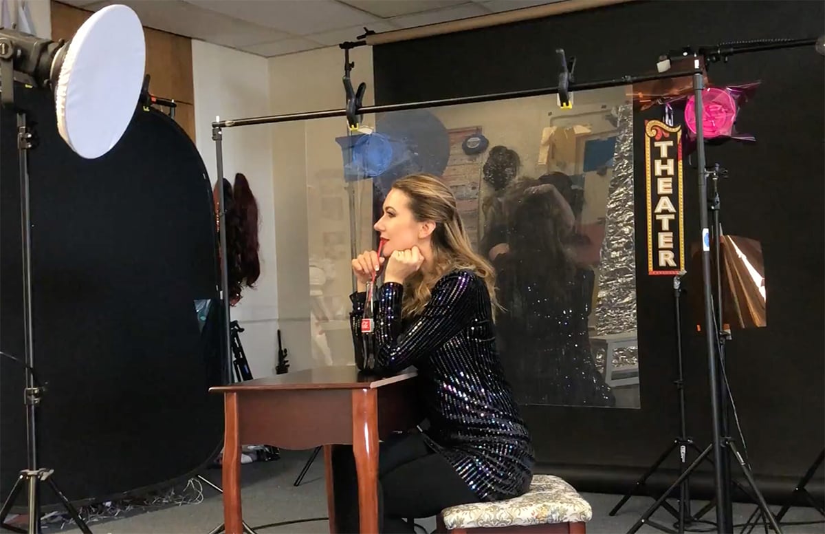 A behind-the-scenes shot of my “Riverdale-inspired” setup.
I decided to use a Beauty Dish as my key light. I found a Beauty Dish controlled the light better than a soft box. I didn’t want my key light to accidentally brighten the background and “wash out” the colorful background lighting I’d be creating with my gels.
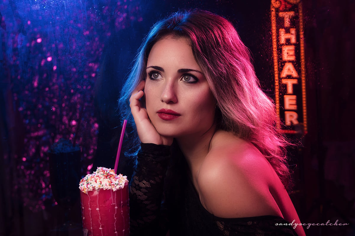 The diffusion material on the Beauty Dish not only provided a quick “fall off” (light to shadow) that only lit the upper body as seen in the original image, but it also made the light softer and therefore more flattering.
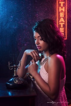 The quick fall off worked out great since the shot pretends to be lit from a regular ceiling light inside our “diner,” which would not light the whole body - just the hair and face. Overall, I wanted the shot to be pretty dark, so we metered for f/8 but I actually underexposed one stop and shot with f/9 (and ISO 100, 1/125s) so that our “diner” looked darker and therefore more realistic.
Once the setup was to my liking, the exciting part began - experimenting with all the different Rosco gels! For me, the original image was just for inspiration. I used it to really understand the lights, the pose, the set and so on.
I determined the colors needed in the image: blue for the “nighttime” feel, and some pink and orange for the glow from the “neon sign.” I began with two strobes behind the wet plexiglass that would shine slightly into the camera, one strobe had the nighttime blue gel and the other had the neon glow pink gel. The last ingredient was an orange gel placed over a flash on a boom stand that lit up the “Theater” sign from above. This made it look like the sign was actually lit up and appeared more realistic. From there, I developed the concept further with different color schemes.
If you were inspired by Sandy Dee’s use of color filters, follow her on Instagram - @sandyseyecatcher – and take her photo-tutorial course on Udemy: “Creative Photography Lighting - The Magic Of Color And Gels” where you will find even more instruction and more of her TV show inspired looks! If you’d like to explore the filters Sandy used to create these Riverdale-inspired images – visit the Rosco Color Effects Filter Kit webpage.

