|
Guest Author: Angelique Powers
A Founding Member of The Guild of Scenic Artists, Angelique Powers has an MFA in Scenic Art Design from the California Institute of the Arts and has been professionally painting theatrical scenery for over 16 years. Angelique also shares her knowledge, passion and experience with her students at the University of Minnesota as a scenic paint instructor. To see Angelique’s work, be sure to explore the portfolio on her website – Qpowers.com. |
If you’ve ever wondered how to make white paint or how to mix off-white tones for scenic work, this guide will walk you through proven methods.
As a scenic paint instructor, I love taking the fear out of our complicated craft and breaking it down into simple parts. The one thing that scares my students most, it seems, is mixing color. When it comes to the subtlety of mixing off-white, beige tone and even greys, the fear sets in faster and deeper because they know that a mistake often leads to a ton of wasted paint. Below are my favorite tips and tricks that I share with my students to help them build their skill, confidence, and speed at mixing colors – even the subtle tones and hues of an off-white.
 All colors can be a bit tricky to mix, but off-whites beiges and greys are often trickier because they’re about 75% white with 1-3 colors mixed in to make up the remaining 25%. Make one mistake adding in any one of those colors and you could ruin the whole batch – leaving you with several gallons of the wrong color. Knowing what colors to choose and how much to use are key. This why I always advise to…
Start Small
The fastest way to end up with too much paint is to go too dark too fast, because you’ll end up needing to add twice as much white paint back into the mix in order to lighten the hue back up again. That’s why I like to start with one cup of white paint and then slowly add in the mix of other colors. You’ll quickly find out which colors are working and which ones aren’t. Once you’ve got a small ratio that works, you can bump it up to a bigger mix
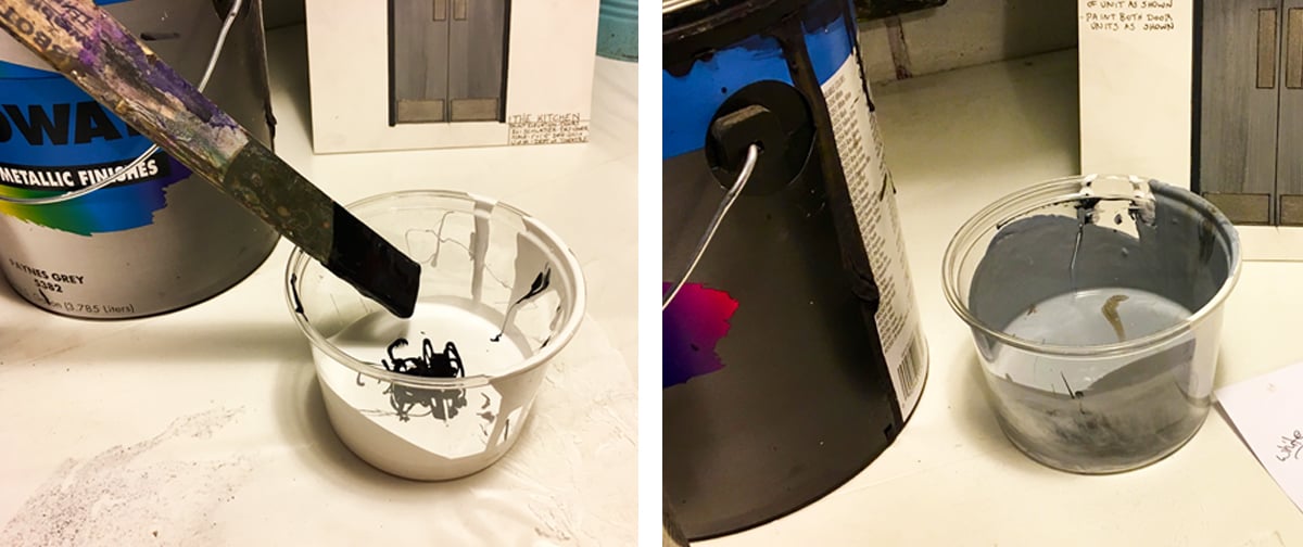
Pro Tip – Avoid Black: When zeroing in on the final off-white color, it can often be the right hue, just not the right shade. If a color is too bright, often the urge is to add black. In reality, using darker colors like Van Dyke Brown, Raw Umber or Paynes Grey are better choices. They have a magical quality to darken a hue without “graying out” the color the way black can.
When teaching color mixing, I like to have my students mix with Rosco Scenic Paints rather than house paint because the colors are pure, they stay bright and they don’t “fight each other” the way that premixed house paint colors often do.
 Off-whites can be broken down the easiest by figuring out what the original color was before without the white to lighten it. Beiges are the trickiest because they are usually a mix of earth tones, usually ranging from Raw Sienna & Raw Umber to Burnt Umber & Burnt Sienna (and who knows what else!!), that are mixed into the white. This is why I think it’s important to…
Learn Your Way Around The Earth Tone Color Wheel
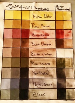 We are all familiar with the traditional Rainbow Color Wheel with Red, Yellow and Blue as the primaries and the center filled in with black. In reality, however, if you were to mix ROYGBIV together, you would not get black – you would get a big muddy brown mess. That’s because when you mix complementary colors together, you are “canceling” out the original color to create a muddy, more neutral shade of the two colors. I teach my students how the Rosco earth tones originate from clay earth pigments, such as umber, ochre and sienna, and that they’re the “pretty versions” of those muddy mixes.
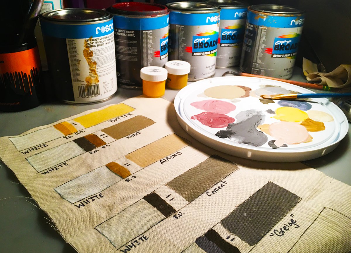
Because this is often a new concept/ addition to my student’s color vocabulary, I made a chart on muslin that compares the Rosco Supersaturated earth tones to the Off Broadway earth tones – each mixed with water and mixed with white – to better see how the colors work. This chart, just like the traditional color wheel, shows how some of the earth tone colors are warmer while some are cooler, and really helps when deciding what color to start an off-white mix with.
Pro Tip – Let It Down: Because Rosco’s Scenic Paints are so rich in pigment, they are often thicker than normal house paint and often do not disperse as well when mixing. This is especially true when it comes to their Supersaturated paint concentrate, which is designed to be let down with water. I rarely use Off Broadway or Iddings straight out of the can when mixing either. I prefer to dilute the paint at least 1:1 with water. This makes the paint more fluid and mix faster. I also find I have more control over how it mixes and I’m able to avoid that dreaded “oops moment” when I realize I’ve added too much color and I now need to add a gallon of white into the mix to lighten it up again.
Five Off-White Paint Recipes For You To Mix Up
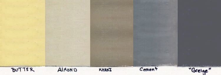 Mixing color takes patience and lots of practice. To get you started, I have included some color mixtures to create some of the more popular off-white and beige colors often needed in scenic painting. Use these “recipes” as a starting point, and then adjust as-needed. I begin with white house paint and all of the colors referenced are Rosco Off Broadway scenic paints:
Butter
 |
4 parts white + 1 part of an equal 50/50 mix of Yellow Ochre and Golden Yellow
A soft, creamy yellow. I use this color as a base tone for faux wood techniques or as a highlight color in foliage.
|
Almond
 |
4 parts white + 1 part Raw Sienna
A very useful, warm off-white/beige. This is perhaps the off-white I use most. I use it as a base tone for sand & light colored ground treatments, as a background/aging color for old white signs and as my go-to “off-white” when the design doesn’t specify what kind of off-white is needed.
|
Khaki
 |
4 parts white + 1 part Raw Umber + 1 part Raw Sienna
A darker beige. I use it as base tone for stone, brick grout (and cargo pants).
|
Cement
 |
4 parts white + 1 part Raw Umber
A more useful grey than mixing black & white. This is the formula I use to start all of my mixes for cement surfaces, whether they’re actually textured or faux finished.
|
Greige (A Grey Beige)
 |
4 parts white + 1 part Raw Umber + 1 part Paynes Grey
In my opinion, this is the perfect grey because it works on stage as both a warm and cool grey (depending on how it’s lit). I use it to paint all sorts of grey things, including stone and metal work like steel panels, pipes and posts.
|
Don’t forget to test-test-test your mixes before you commit to making a large batch, especially when mixing custom off-white tones. Remember that paint will almost always dry slightly darker, so keep your wet-mixes a little lighter than what you want the final outcome to be.
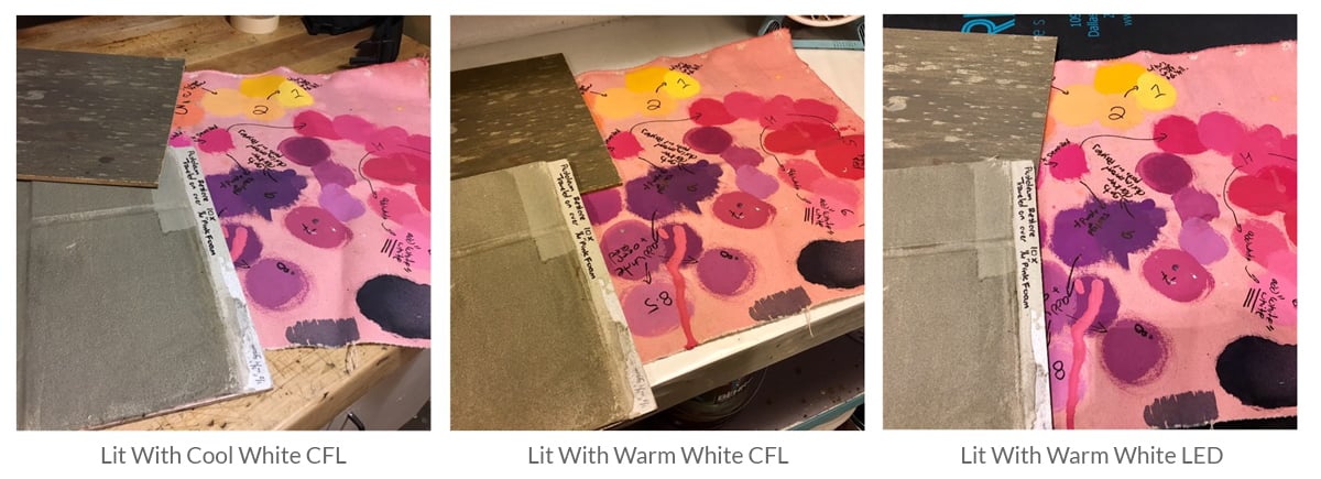
Pro Tip – Beware Of Metamerism: Metamerism is a phenomenon that occurs when colors change when viewed in different light sources. The cooler/greener lighting produced by the fluorescent fixtures that are often found in scene shops are famous for sucking the life out of all colors – especially beiges! You will find that your color mixes can really shift once you get them out on stage with the warm, full-spectrum incandescents. If at all possible, try to have the lighting in your mixing area as close as possible to the lighting set up of the performance area.
 Mixing paint can be an intimidating technique to learn. As with any technique, you learn it with years of practice. Hopefully, the Pro-Tips and recipes above have helped alleviate some of your color-mixing fear and inspires you to mix up your own off-whites, greys – and any other color your scenery needs!
Save
Save
Save
Save
Save
Save
Save
Save
Save
Save
Save
Save
Save
Save
Save

