

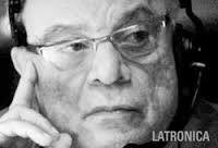
If you google the late lighting designer Patrick Latronica, you will find more than one entry that looks like a Rosco marketing piece. Patrick’s brilliant lighting designs were seen in major theaters, in 34 countries – across five continents and won several important critical awards. He also maintained a parallel career as a grand event Production Manager for IBM, Coca Cola, and Mini Morris. What I appreciated most though was how pleased (even grateful) Patrick was to be – as he put it – “a Rosco poster boy.” Patrick showed a wonderful degree of modesty and gratitude for the opportunity to share his stunningly colorful work through us, so we thought we’d share his work and our fond memories of him one last time.
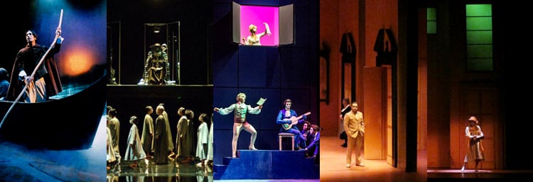
 Our first project together – a scene from “I Promessi Sposi,” which won Best Italian Musical in 2002
Patrick received a B.A. in Theatre at Syracuse University and then enrolled at NYU. He had the opportunity to experience the New York theatre scene in the 1960’s, which was an era of vital, experimental theatre. Patrick worked as a stage manager for several famous productions including Athol Fugar’s The Blood Knot. Looking for new challenges, however, he moved to Europe and found work lighting small, avant-garde dance companies. In Rome, his reputation as a designer and artist grew – despite the fact that the role of Lighting Designer did not officially exist-- a sad fact that continues to this day.
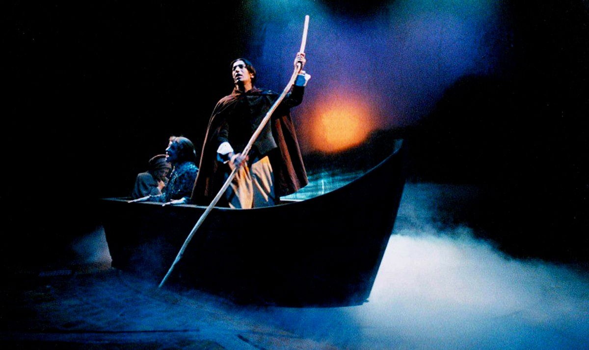
 A comparison of Latronica’s use of color in Tato Russo’s “A Portrait of Dorian Gray”
Patrick’s hallmark was his bold, assured and original use of color which he claimed was always the starting point for his inspiration and analysis of a text, a dance or an operatic score. At the beginning of every new project he had a point of departure. It could be a place that he had visited, a painter he loved or a palette associated with a historical period – but it was always about color. When Patrick’s name came up in conversations someone always said, “Nobody uses color like Patrick and he never gets it wrong.” Patrick loved to use the warm-cool hues inside lavender and purple – colors that are rarely seen on stage in Italy. In Tato Russo’s musical version of A Portrait of Dorian Gray, he used the chameleon-like lavenders to emphasize the sensuality of the orgy scene, and the lavender-blue modelling light to add front light so that the audience would follow the dialog and song.
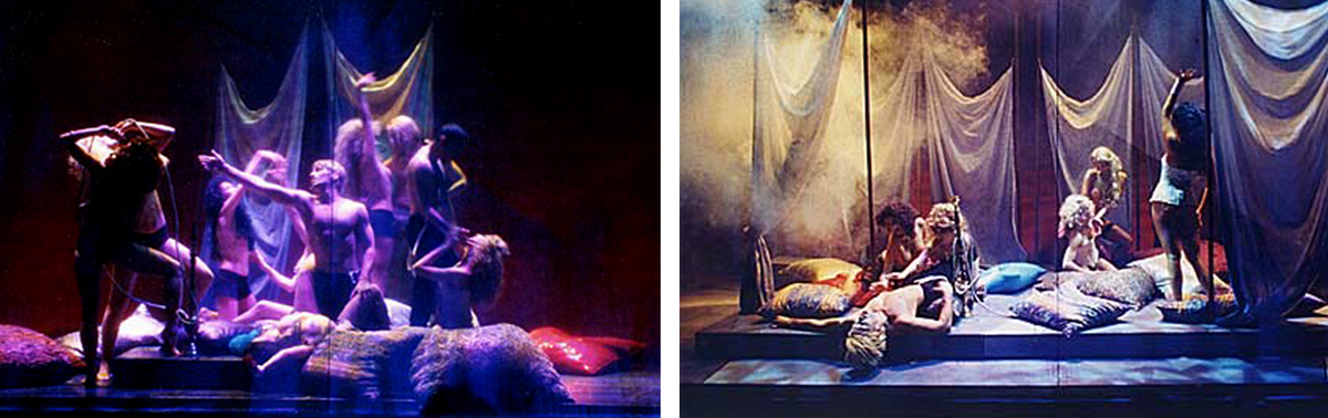
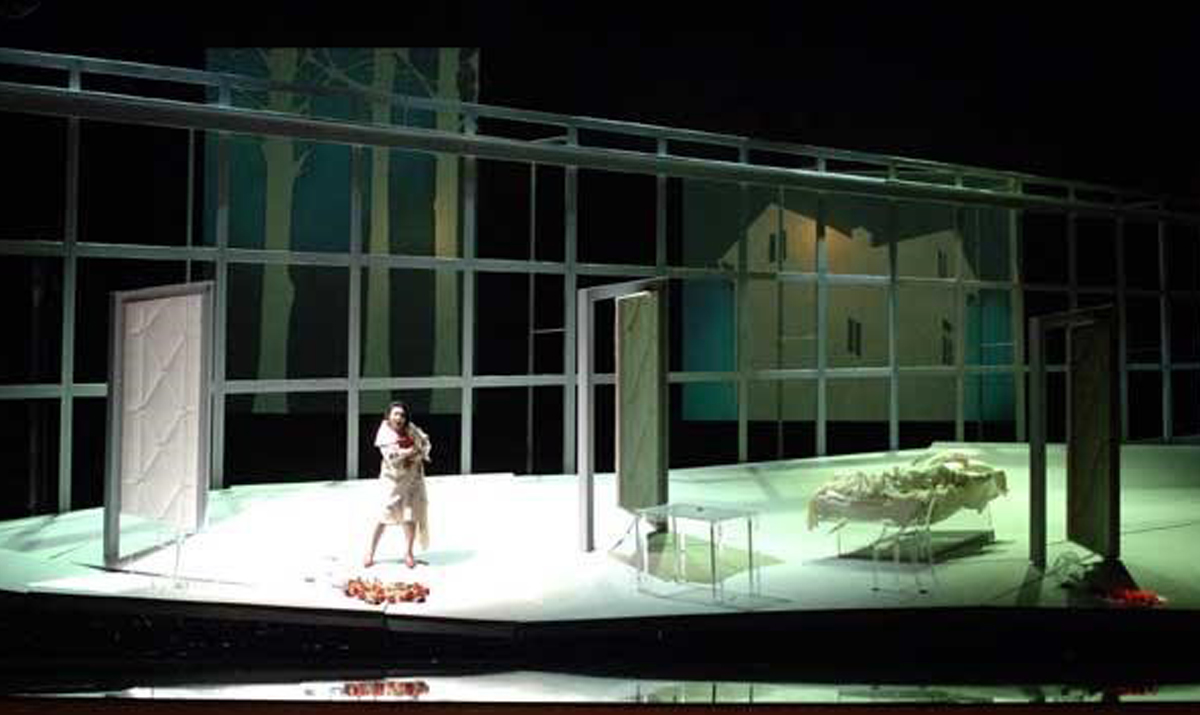
 A different color palette to describe Dante’s Inferno - Greens, not Reds and Oranges
Wanting to add contemporary relevance to the Teatro La Fenice’s double bill of Rachmaninoff’s Francesca da Rimini and Arnold Schoenberg’s Erwartung, Patrick remembered the public lighting that he had seen on his many trips to India with its fluorescent, green cast. Many designers woul have flooded the stage with reds and oranges to depict hell but Patrick’s version of the Inferno was a mixture of green effects filters, gobos and plus green correction filters. He wanted to create a mood that was “eternally oppressive and melancholy,” which he felt more fitting for Dante’s unhappy couple. The lighting was also reflected from a mirrored floor, which helped add an unworldly atmosphere to the production.
 An actress feels the weight of Patrick’s lighting design and her character’s heavy burdens in “Erwartung”
Does light have weight? It seemed to when Patrick designed it. Erwartung is a one act monodrama set in an abstract forest. In this production, the forest was suggested by the backing, but the actual setting is an apartment in which, according to Patrick, “the green light, mixed with white and warm sources, became as ‘heavy’ as the burden that the heroine carries.” Heavy light for the weighty burden of the character that has murdered her lover in this production.
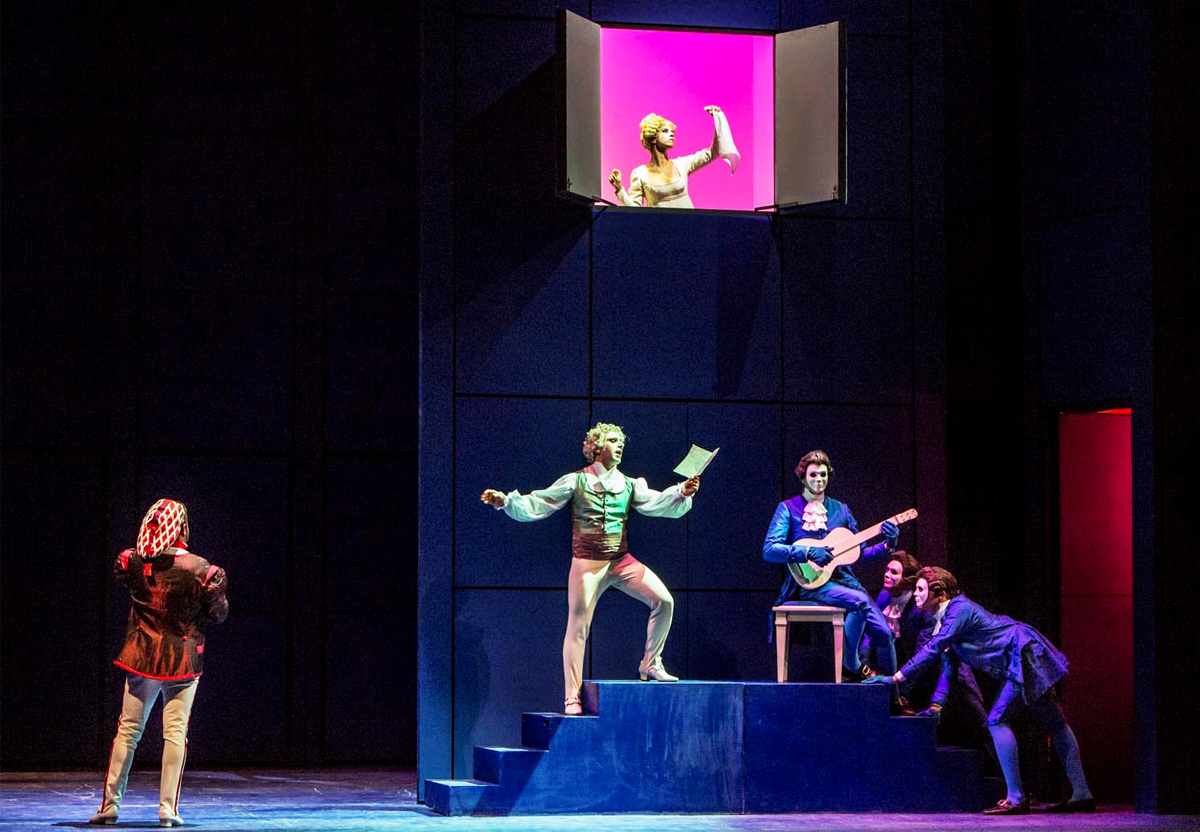 Latronica used “Dayglo” colors to cast a little magic into a commedia dell’ arte-styled “Il Barbiere di Siviglia”
Patrick regularly worked with Director Italo Nunziata and Scene Designer Pasquale Grossi. For a production of Rossini’s Il Barbiere di Siviglia, they decided to constantly change the configuration of the space using a midnight blue, ”magical box” set from which the scenic elements would pop up or slide on or off stage. Patrick chose a 60s color palette that he called “Dayglo” to emphasize the commedia dell’ arte production style. The white backings behind the openings acted as bounce surfaces and were balanced by the saturated lighting of the “dead” areas.
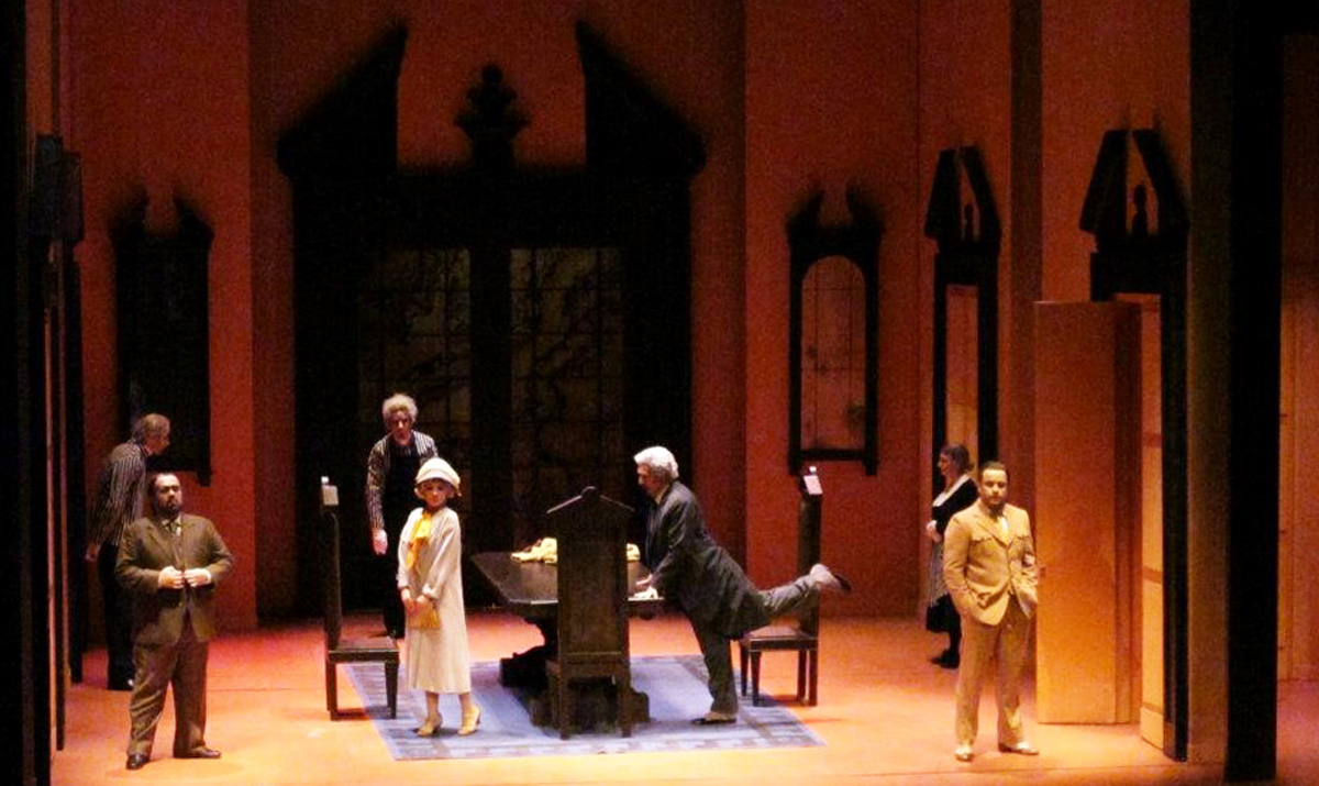 Latronica’s expert use of saturated color exaggerates the farcical elements of Donizetti’s "Don Pasquale"
In 2002 the same creative team produced Donizetti’s Don Pasquale . It was a huge hit, and was still being presented in Italy as late as 2015 after being seen in many European cities. It was conceived as an homage to the Italian film comedies of the 30s and set in a Roman textile factory where the protagonists pretend to work while setting their intrigues in motion within an Art Deco setting. Satirical comedy often calls for contrasting, often complementary, colors that reveal the one dimensional nature of the characters. Don Pasquale, however, also contains sentimental and even melancholy elements that Patrick underlined in the tenor’s romantic scene – complete with top-lit moonlight.
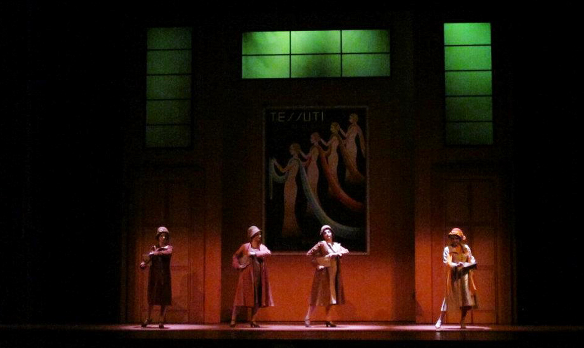 Note the rich colors Latronica used to illuminate the Art Deco set in this scene from “Don Pasquale”
 Before every new show, Patrick took out his swatch books and looked at the the colors as if it were the first time. He enjoyed using new technology and different ways of distributing light on stage but it was his highly original and thoroughly beautiful use of color that earned him the title of “Maestro” among his colleagues. Patrick left us in 2014 but it is a touching tribute to him that his friends continue to post messages and reminiscences on his Facebook page and have organized the IBC Sicilia Prize for Promising Dancers honoring his “love for the arts & his life-long dedication to dance.”
Margie Heymann February 09, 2016 Questions?