Alex Connor is a scenic designer and scenic artist for theatre and opera based in La Crosse, WI. We discovered Alex thanks to the scenic images we found on his Instagram Account that detailed his scenic work on a production of "The Mikado" at Viterbo University. The striking scenic panels in the background came to life before our Instagrammed eyes, which culminated in a ballet of scenery in a video that Alex posted during final tech. We liked what we saw so much that we asked Alex to share his experience on the production. Below is what he sent us:
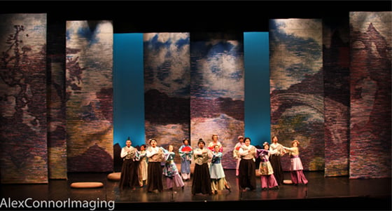
The Mikado, written by Gilbert and Sullivan in the late 19th Century, is a comedic operetta revolving around the town of Titipu and those who inhabit it as they struggle to abide by the laws of the Emperor of Japan - also known as the Mikado.
In conversation with the director, David Gardiner, it was clear that the eight panels, eight feet in width by twenty-four feet in height would be a challenging but impactful feat of construction and scenic artistry. It had been decided to paint these transforming surfaces to resemble an atmosphere similar to that of the impressionist oil paintings of Claude Monet, with a Japanese-influenced sense of composition and value movement.
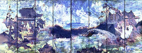 While planning the surface treatment for the panels, I had to maintain certain criteria to support in the story-telling. Considering these panels would track across stage creating different environments, there needed to be enough contrast in value to maintain a presence. Quite contradictory to this, there also needed to be enough neutral tone in each panel to aid the lighting designer in transitioning moods, reflecting throughout the panels.
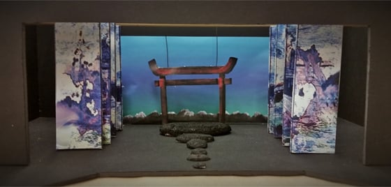
Here is the model with the elevations for the panels:
 Starting out, the first few layers of applied paint roughly accomplished the value contrast needed. First, the sky would be laid-in with a series of scumble techniques, followed by blending and texturing with a rag-roller. This step would include a number of colors made with Rosco’s Off-Broadway Pthalo Blue, with chosen amounts of white paint mixed in to create a moving cloud scape. Next, the focal points of the composition would be laid-in in the same manner, using mostly Phalo Blue and Deep Red, being aware of the content that was in the specific location, including water, foliage, and man-made structures.
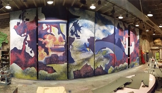 It became clear that even with distance, the edges of the architecture and other focal points in the landscape had to be softened and textured further. Working with Frank Ludwig, Associate Professor at Viterbo University, we developed a plan to introduce a horizontal striation patterning, similar to those in the works of Monet. At the same time, we re-established the balance of neutral tones.
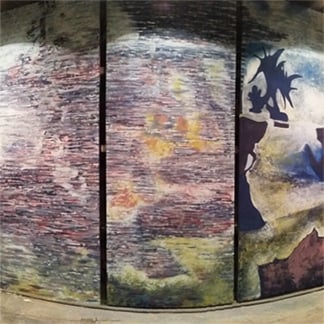 As a final step, we deepened the focal points with darker hues to redefine the contrast in value. This was done in the same manner as the neutral tone patterning, which gave a sense of depth in saturation and hue.
Here is the final result, as well as the panels in movement:
To learn more about Alex Connor, and to see his various portfolios, visit:
www.alexconnordesign.com


