

Thanks to the Sochi Olympics, the eyes of the world are getting a glimpse into Russia's culture and heritage. Just as Bob Costas and Mary Carillo might introduce us to Russian culture in their broadcasts, we thought we'd share some insights with you into Russian theatre. Damir Ismagilov, chief lighting designer for the Bolshoi Theatre recently spoke with Rosco’s Ron Knell where he shared some stunning images from a few of his most recent projects, along with memories from his storied, 37-year career backstage in the Russian theatre.
In 1977 when Mr. Ismagilov began working, Rosco and Lee filters were used only in the Bolshoi Theatre, Maly Theatre and Moscow Art Theatre. These three national theatres could afford those filters, but the rest of the theatres in Russia (Soviet Union at that time) used filters made by the local theatre industry. Ismagilov, at that time, used those domestic filters, which only had a range of 10 to 12 colors and were not consistent from batch to batch. "This also made it impossible," Ismagilov tells us, "to get, for instance, a thick blue color.”
 “Kromy” scene from "Boris Godunov", directed by Leonid Baratov, designed by Feodor Fedorovski.
Today, Ismagilov has more than 12 different colors installed into one color scroller alone – including a host of rich blues – and he uses them to create scenes like the Kromy scene above. There are color scrollers installed on most devices in the Bolshoi Theatre, and all of them are loaded with either Rosco E-Colour+ or Supergel. When asked why Rosco, he says, “When I install filters in a scroller, I want to change them once a season. Rosco satisfies this demand.”

 Bolshoi Theatre’s color scrolls as displayed in Rosco myColor.
Ismagilov enjoys the wider palette available to him now and relies on it to create classic looks, adding though, that if he strays too far into “artificial” or unnatural colors, he might hear "Have you lost your mind? Why use this filter? We work in a classical theatre, and this filter is for a disco or a concert. There you may do as you wish. But here you ought to make it beautiful!"
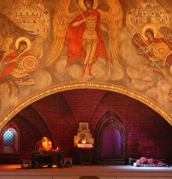
 “The Cell” scene from "Boris Godunov"", directed by Leonid Baratov, designed by Feodor Fedorovski.
Colors like E-Colour+ filters #132, #105, #201 and Supergels #23 and #371 help him create those beautiful, classic looks, such as the stage shot pictured above. During this scene, the morning gradually succeeds the night. It starts with cold light in the window and behind the door. The audience sees Pimen sitting at the table and Grishka Otrepyev sleeping. Warm sanctuary lamps illuminate sacred icons and a candle on Pimen’s table glows. The cold light in the windows and behind the door gradually warms as dawn arrives.
 "Demon" at the Moscow Academic Music Theatre, by Stanislavski and Nemirovich-Danchenko, directed by Gennadi Trostinetski, scenography by Semen Pastukh.
Demon used Rosco's Twin White RP Screen with a line of wash lights behind it. Aloft were the demon's wings, which metamorphosed according to the scene, acting at times as the demon, and at others as simple clouds.
 The scenery also acted as a gobo when lit in a specific fashion. The team added projected Rosco gobos to the textured shadows of the wings on the stage floor and blurred those images to create the special atmosphere.
When asked where he turns for inspiration for evocative designs like Demon, Ismagilov says, “in 1982, when I was a child, I saw the film Blade Runner . Now I tell all young lighting designers, ‘Watch the movie. If you can see and understand how the light is set, you can become a good lighting designer. If you can’t see or understand it, give up and don’t waste your time.' That is why I watch this movie again and again even now. It’s my source of inspiration.”
 A scene from "Svadebka" (The Wedding) by Igor Stravinski, the second part of "Maitre of Ballet". Scenery by Valery Levental, choreography by Alla Sigalova. Novosibirsk Opera and Ballet Theatre.
Ismagilov, like other lighting designers, also takes his inspiration from the source material. For example, he uses deep reds, including E-Colour+ #164, to create a tense atmosphere, as he did in the stage shot from Svadebka above. "The music is filled with emotional tension. Just listen to the music. It is tearing the soul out of you. So the color should too. I was scared there. This is definitely Stravinski.”
As we bid farewell to the Olympics in Sochi, perhaps we should take inspiration from Damir Ismagilov and have a listen to Stravinski’s Svadebka while we schedule Blade Runner into our video queues.
Wendy Luedtke February 20, 2014 Questions?