by Stan Schwartz, Executive Vice President
The “Share The Work” initiative, in which we asked lighting designers to send us photos of their work, has yielded an extraordinary outpouring of lighting ideas.
We are currently creating a searchable Color Resource Gallery, in which we’ll display the photos and the designers’ narratives, organized by the criteria most designers use when they are doing their pre-design research. The Gallery should be available on the Rosco web site by the end of the year.
Meanwhile, we thought you’d like to see some of this fine work and read what designers had to say about their color choices. Between now and the end of the year we’ll post more of the pictures-and-descriptions we’ve received. Watch for these posts in Rosco Spectrum in the upcoming months.
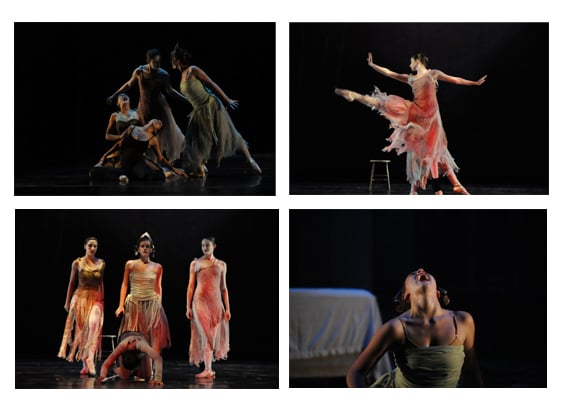 Thomas Rodman, lighting. Dracula.
Thomas Rodman writes: Dracula, produced by The Montgomery Ballet as presented at the Alabama Shakespeare Festival on the Festival Stage in 2009. Lighting Designer: Thomas Rodman. Rosco Colors Used: R362, R80, R26 Rosco Gobo Used: R77805 I chose these colors in short for three reasons - simplicity, emphasis and definition. The combination of the R80 toplight and a no color top template wash along with a neutral colored sidelight allowed me to sculpt not only the mood of the scene but highly define the dancers bodies and movements. The R26, which was some of the only frontlight used in this production, was used to heighten the emotional charge of a few specific scenes.
Rosco Comments: There are roughly 60 shades of blue filters in the Roscolux range. Of these, R80, Primary Blue, consistently ranks among the best sellers and Thomas’s comments probably explains why it’s so popular. It sculpts performers well, and provides a clear mood definition of its own. R26, Light Red, was a good choice to, as Thomas writes: “heighten the emotional charge.”
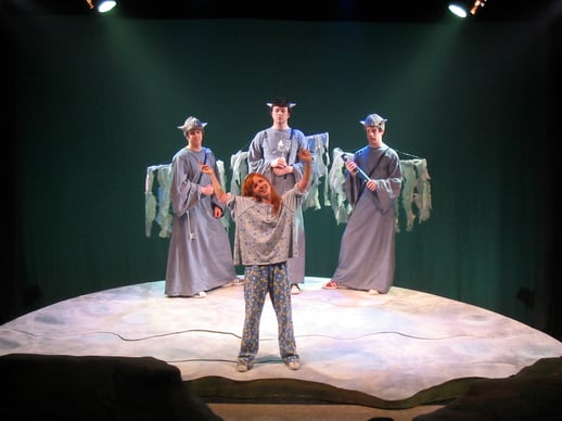 Owen Hughes, lighting. The Curvature of the Earth
Owen Hughes writes: The photo is from a production of The Curvature of the Earth, written by Brian Cronin, directed by Jessica Davis-Irons, and produced by Andhow! Theatre Company at the Ohio Theatre in New York. Lighting Design was by Owen Hughes. I used Rosco #4360 as the back light and accent light color for this scene. The main character is a young girl, who, among other flights of fancy, takes a trip to the moon and meets with the moon's three wise men. The director and I knew that the scene had to look like a child's idea of the surface of the moon, and the Rosco 60 count cyan gave it a bright, vivid quality, while also (in conjunction with a little haze), giving it a slightly aquatic feel, almost as if they were floating in a mist or fog. The R#4360 worked perfectly to create the unique look we wanted.
Rosco Comments: If you don’t recognize R4360, that may be because it was originally created as part of the CalColor range. This group of filters offers precisely calibrated (hence, the name CalColor) primary, secondary and tertiary colors for filmmaking. Rosco won an Academy Award® for developing this line. Of course, theatrical designers, like Owen, discovered the colors quickly and many of the filters were incorporated into the Roscolux swatchbook.
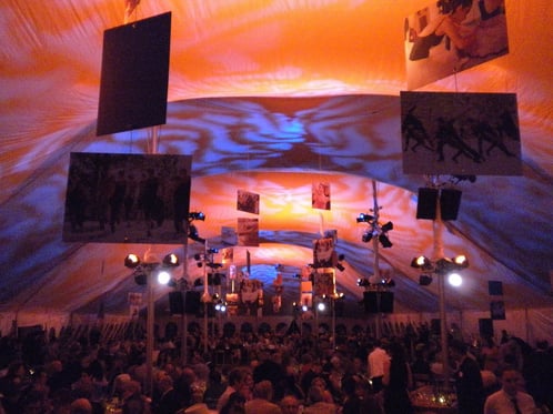 Heather Sperling, lighting. Fundraising event for Jacob's Pillow Dance Festival
Heather Sperling writes: This is a photo of a fundraising event I lit for Jacob's Pillow Dance Festival, where I worked a few years back. I had heard stories of the headaches the guests/staff experienced the previous season from staring at the same color for too long, so I used R79 and R21 to crossfade back and forth to keep everyone's eyes from fatiguing. As a bonus, the bounce blended into a lovely lavender color that made all the guests look quite attractive.
Rosco Comments: Are there two more complementary colors than R79, Bright Blue and R21, Golden Amber? We doubt it. That’s why Heather’s choice of these two filters made so much sense “to keep eyes from fatiguing”.
Do you have work you'd like to share? You'll be rewarded with some amazing free swag.
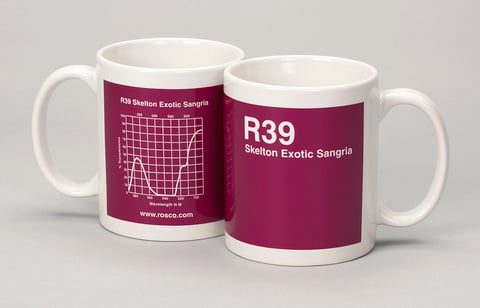 The photos and text above were among the many submissions we received in response to our “Share The Work – Get The Swag” program. Send us a photo of your lighting work, emphasizing your color choices, and we’ll send you the neatest swag we’ve ever done: the Roscolux/Supergel coffee mug is artfully colored in one of ten colors, complete with its SED curve.
It’s easy to do and worth the time. Details at www.rosco.com/sharingforswag/

