The Rosco e-colour+ range of colour filters has over 200 different hues. If you have ever wondered what each of those filters looks like on camera, then you will want to explore Sergio Fabara’s Kinofabara blog. Fascinated by both colour and LEGO, the Spain-based photographer, cinematographer and journalist captured the whole range of e-colour+ colours in 212 individual LEGO shots!

Not only is Fabara’s post an excellent visual guide to our e-colour+ filters, the blog (published in Spanish) also provides valuable information about how to choose the colour you need based on the filter’s spectral output and the image capture system you are using.
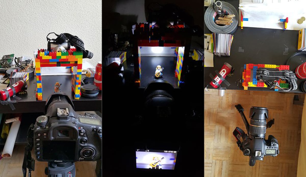
Here's a look at Sergio Fabara’s setup for this shoot. It consisted of two LED camping torch lights, one illuminating from the top and another projecting light to the bottom. The camera used is a Canon 7D with a Tamron 24-70 lens set to f8 and the images were captured RAW in Adobe RGB colour space.
What Are Those Spectral Charts In The Swatchbook?

“The first thing we look at when flicking through swatchbooks,” Sergio says, “are the colour filters. However, what our eye perceives is not always what the camera captures. It is, therefore, important to understand the spectral chart included in the swatchbook to have a better idea of what kind of light we could be getting.”

Here is a breakdown of the spectral emission distribution (SED) chart found inside all Rosco swatchbooks. The X-axis defines spectral wavelengths and is measured in nanometres. On the left side are violets and blues, closer to the center are greens and yellows, and on the right side are oranges and reds. The Y- axis shows the percentage of those wavelengths transmitted by the filter.
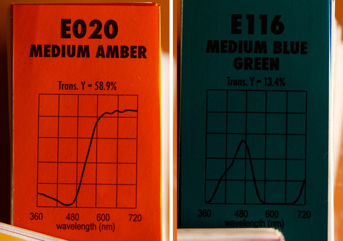
In Fabara’s blog, he illustrates the spectral output by comparing two e-colour+ filters: Medium Amber E020 and Medium Blue Green E116. In the case of Medium Amber, Fabara points out that the chart shows the transmitted light is predominantly from yellow to red, while the Medium Blue Green indicates that blue, almost cyan, predominates.
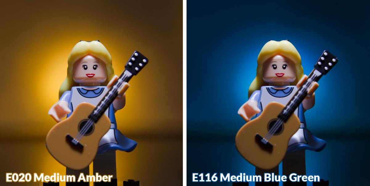
“We can now observe,” Sergio says, “that one of the colours is warmer, but because it transmits a wider scope of wavelengths, it will not be a pure orange. The second filter has a bluish tone, and its narrower SED curve means the colour will be much more specific and clear in the final image.”
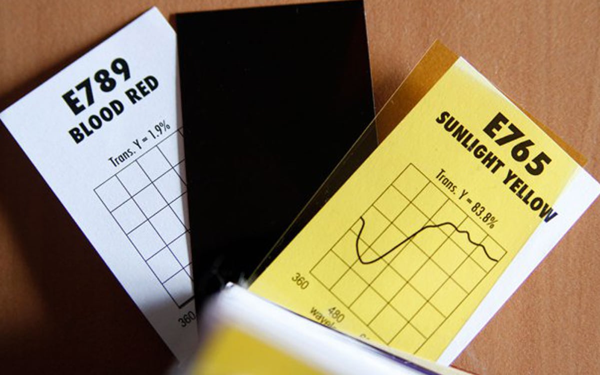
Fabara then looks at the total transmission, which is specified on the top of the spectral chart as “Trans. Y = XX%”. The percentage value represents the quantity of light passing through the filter, which will affect not only the exposure but also the resulting colour. The higher the percentage of transmission, the more light will pass through the filter and its colours will be much more pastel. If the percentage is low, the filter will absorb more light, but, when well exposed, it will give more saturated colour and will have more specific tonality. Sergio believes, personally, that filters with high transmissions are better visualised when slightly underexposed. He uses e-colour+ Blood Red 789 and Sunlight Yellow 765 to demonstrate the difference in transmission.
Matching The Light To The Filter

“The next step in choosing the proper colour filter,” Sergio explains, is to know what light will be used in the shot.” Now that we know the properties of the filters, it’s important to know the properties of the light they’re filtering. Some light sources produce particular spectral outputs better than others. Tungsten lights, for example, are more efficient on the warm side, while flashes and HMI are more efficient for cooler tones. Fluorescent bulbs can produce cool or warm tones, depending on which ones you’ve got (warm white vs cool white), but they’re more prone to green spikes the eye cannot see and often need to be corrected. The same can be said about LEDs – some LED fixtures work well, others do not.

Bearing this in mind, Sergio continues, lights with warmer colour temperatures will work better with warm colour filters. E020 Medium Amber on a tungsten light, for example, will produce a much more saturated colour because there is more orange/red energy coming from the light in the first place. Colder tones will work better with light sources more efficient on the blue spectrum. Medium Blue Green, for example, produces a beautiful blue on an HMI source.
Choose The Proper Colour Temperature

One important element that can considerably influence the colour hues when capturing an image is the colour temperature setting of the camera. In the blog, Fabara illustrates this by showing how E 020 Medium Amber and E116 Medium Blue Green render in different colour temperatures.
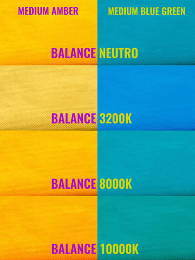
Both photographs are captured with the fixed colour, only the colour temperature of the camera is changed. “Notice,” Sergio says, “that, when set to 3200K, the Medium Amber is almost neutral while the Medium Blue Green turns bluer. On the other hand, when set to 10,000K, Medium Amber gets more orange and saturated while Medium Blue Green transmits more green because the blue is more neutralised.
See It To Believe It

Sergio understood that many would find it difficult to envision the colour filter results and would prefer to have a visual guide that demonstrated what they look like. This is why he set up his LEGO-themed photo shoot – to give photographers and cinematographers a professionally shot representation of each hue in the e-colour+ range that they could refer to when choosing their colors.

To see the complete photo spread featuring the entire range of e-colour+ filters in high-resolution visit Sergio Fabara’s Flicker page. To learn more about these filters, and to see the SED curves for each filter, visit the e-colour+ web page or explore inside our myColor web app. If you’d like to set up a similar photo shoot with your favourite colours, you can purchase large swatchbooks of every Rosco filter range, including e-colour+, Roscolux and Cinegel. There are two sizes – the 3”x6” (8cm x 15cm) Super Swatchbook and the 6.5" x 12" (16.5cm x 30.5cm) Light Lab Edition.
Save
Save
Save
Save
Save
Save
Save
Save

