During a recent visit with the lighting designers at Michael Grubb Studio in the UK, the topic of trade shows came up. We asked them “what aspects of a company’s booth inspires you when you visit a trade show?” Their answer: “it really has to be much more than a product display wall. With over so many exhibitors you have to be different, while keeping your integrity.” Michael Grubb Studio’s philosophy is “Be bold, Be brave and above else Be you.” Those values meshed perfectly with ours, so we hired MGS to design our stand for Light + Building 2016 – and it was one of our most striking trade show booths ever. Below, Stuart Alexander, the senior lighting designer at Michael Grubb Studio that designed our stand, describes the process of creating an exhibit that would tell “The Rosco Story” to the thousands of architects and lighting designers that visited the show.
Getting To Know The True Rosco
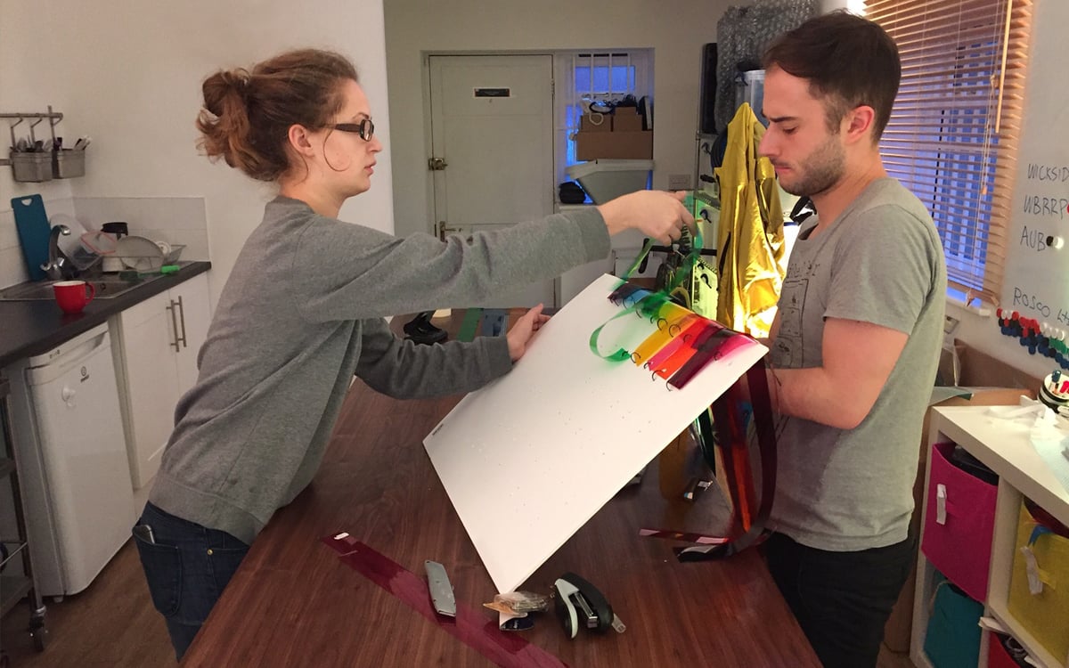
My team began by visiting Rosco’s London office. We wanted to get a feel for the “true” Rosco. Everyone we met talked about “being a family” and there is a real passion inside the building that emanates from the people within. They showed us how gobos and swatch books are made as we discussed their rich 106 year history. It became apparent that we needed to tell the story of Rosco, from Gels to LED fixtures – where they came from, where they are now and where they are headed.
The “Gels To LEDs” Concept
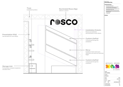
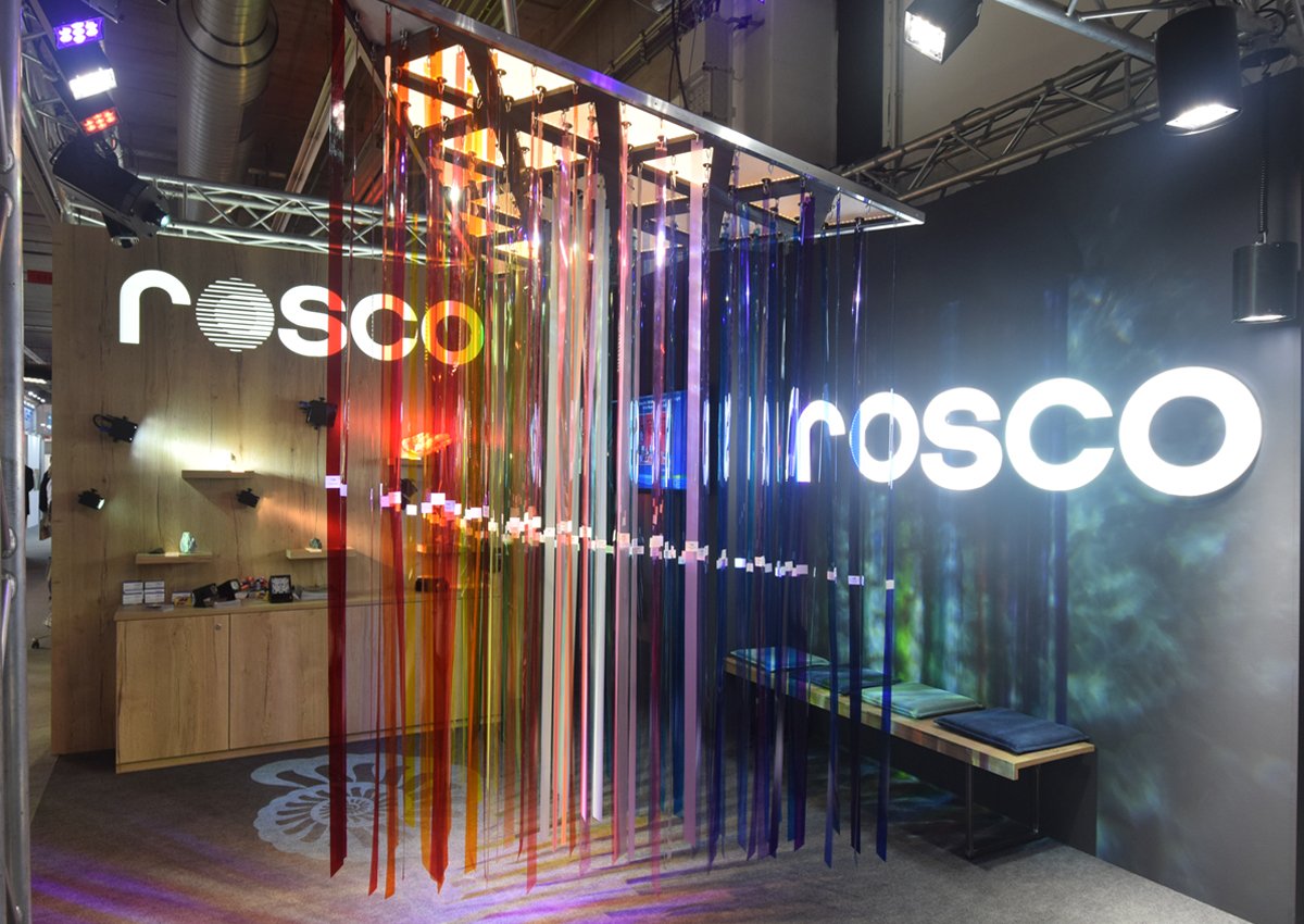
We wanted a clean and simple environment that placed all emphasis on what can be achieved by using only a limited range of products. We believed this approach would de-clutter the space and provide greater impact for those visiting the stand. The concept was to combine Rosco’s rich history into one simple installation – essentially combining the old and the new. This led to the idea of combining Rosco’s colour filters with their newer LED technology.
Maxwell’s LitePad Colour Triangle
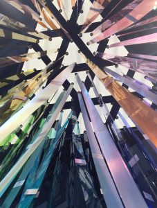
We love colour at Michael Grubb Studio and we love the depth and variety that Rosco’s broad range of filters gives us; they have a deepness and purity beyond comparison. Flicking through the filter book and feeling the light and colour is one of our favorite office pastimes, so we decided to supersize the swatch book and allow visitors to the stand to “fall in” and explore the full spectrum of colour and light! We envisioned this installation as if you are falling into Newton’s prism or Maxwell’s colour triangle.
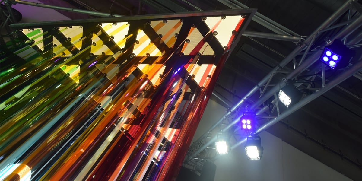
We needed pure white light to emphasise and enhance the colours on display; we also wanted to animate the space. Therefore, we chose to suspend the colour filter installation from a specially designed, CNC’d triangular frame that incorporated 25 triangle pieces of 2800K Custom LitePad HO90. Each LitePad had to be identical with holes pre-drilled into them that would allow for the hanging hooks to hold the cascading colour filters. The Custom Litepads worked perfectly! Their slim-profile, lightweight nature and customization allowed us to be creative as we easily designed and installed the piece in the booth.
Toplit With Triangles – Sidelit With Cubes
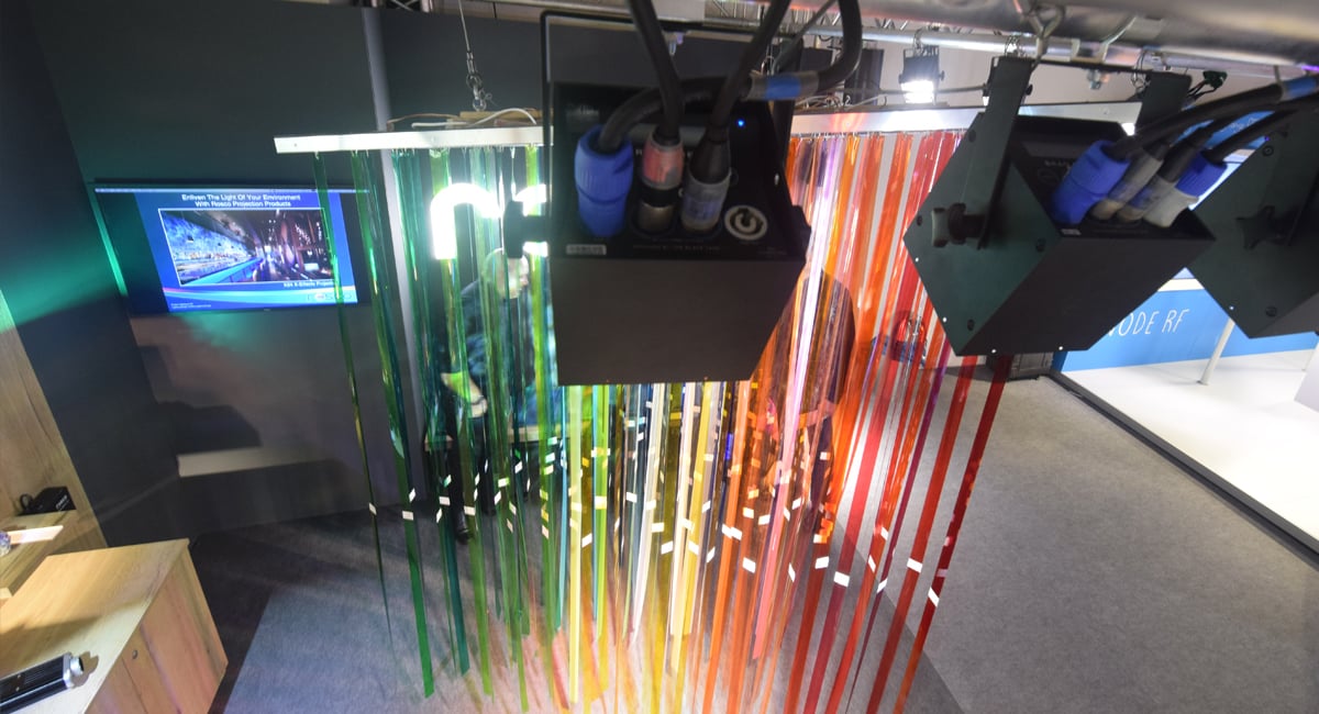
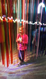 The Custom LitePads above the filters did a great job of giving the filter installation shape and space inside the stand. However, the soft, diffused light traveled parallel to the filter strips – so very little color projected through. We used several of Rosco’s high-powered Braq and Miro Cube LED fixtures to illuminate the installation from the sides. This approach allowed us to create various lighting effects through the colour and onto surrounding surfaces.
To bring this installation to life, we programmed a sequenced light show that would illuminate the individual Custom LitePad triangles above, and fade-in/color-change the various Miro & Braq Cubes on the sides. You could see the effect the magic and intrigue this technique had on visitors when you saw the delightful looks of wonder on their faces as they entered the booth.
Geodes To Light On The Back Wall
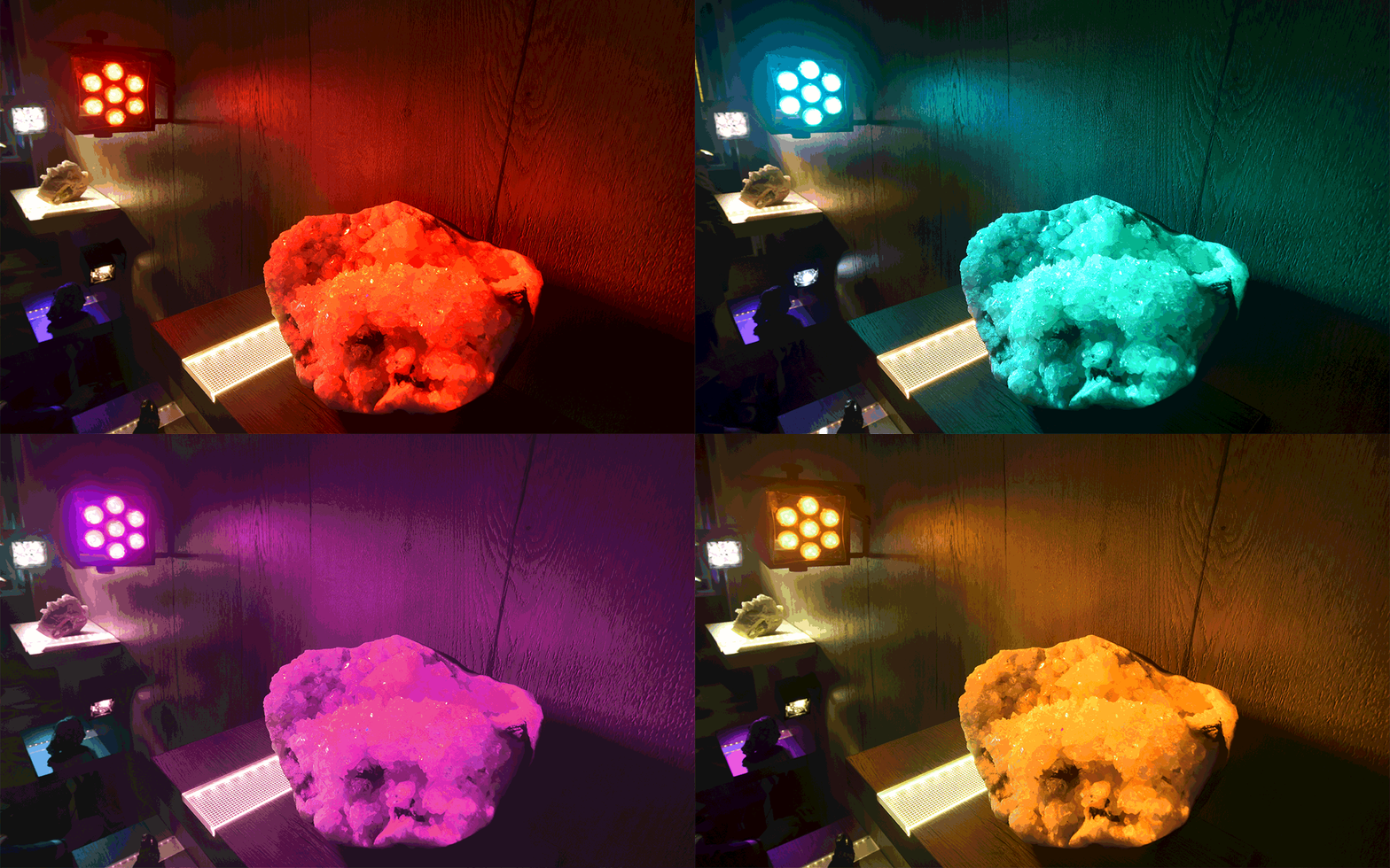
The stand, ultimately, still needed to display Rosco products. Throughout Light + Building you can see thousands (if not millions) of luminaires on display. Rarely do these displays fully demonstrate the unique qualities and options those fixtures have to offer. We hoped that our approach would not only show off the features of Rosco’s Cube Family of LED fixtures, but also help make a striking spectacle to behold in the space at the same time.
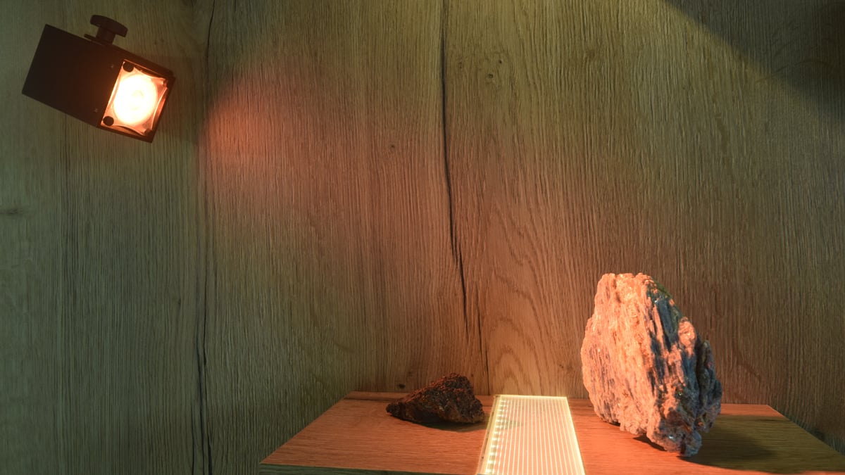
Being that we had triangles up above and cubes on the side, we chose to use crystals as a way to draw attention into the stand and to bring an exhibition feel to the space. The way the crystals took the light from Rosco’s new Pica Cube worked massively in our favour – especially the UV and 4C models. It was important to us that we give people an idea of the quality of the light the fixtures actually create.
Thanks to the incredible stand design from Michael Grubb Studio, the Light + Building trade show was a huge success that enabled us to tell the story of how Rosco is the company you want to rely on when the color and quality of light is important to you. Whether it’s modifying light with our color filters and gobos or creating light with our LED fixtures – Rosco’s got the solution for your next project.
