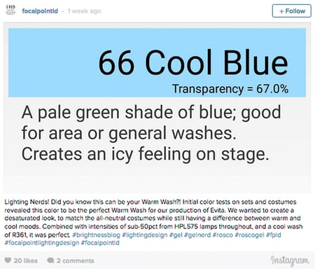
Lighting designer Ryan Terry was designing a production of “Evita” for the Tuscany Theatre Company when he discovered how he could use R66 Cool Blue as a warm wash color. Ryan shared this via his Instagram account and tagged us in the post. We reached out to ask him to share his technique with us, and below is his reply.
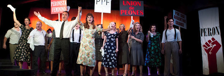
 At the first production meeting, director Andrea McFeely let us know that she had settled on neutral tones to emphasize the place and time of the play: post World War II Argentina. I wanted my stage washes to have a difference between warm and cool, yet be close enough that it still retained a de-saturated look on faces and costumes.
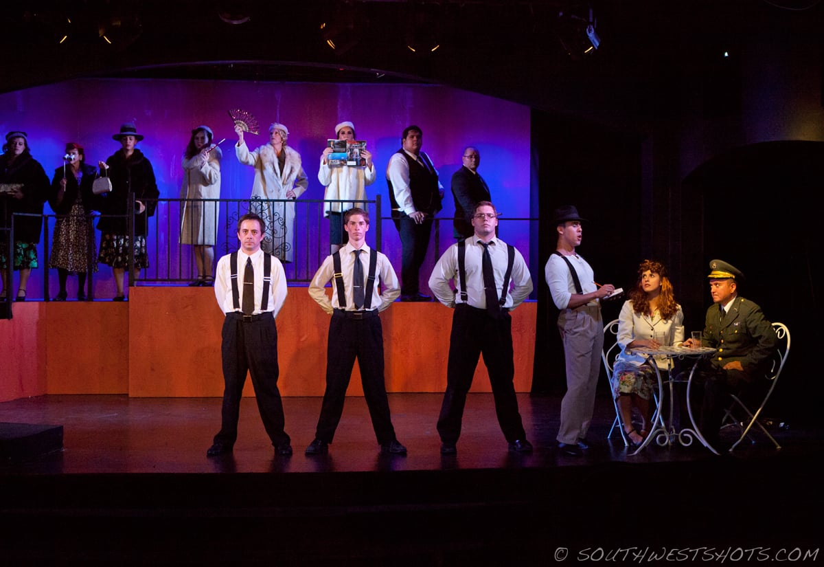
The theatre was a small, proscenium-style space and I had very few conventionals and LED's to work with. The short throw distances kept intensities down to 50% or lower for most scenes. I picked out my warm colors, R05, R304, R33, and R99. My cool colors were R66, R361, R69, and R55. With these colors, we did a test on costumes and the set.
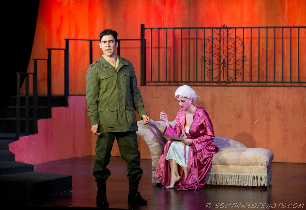
I noticed right away that the warm colors were not going to work, since the set had been painted salmon-pink. The warm colors were making the set explode in reds and magentas. The cool colors corrected this, but I still needed a warm for skin tones. Surprisingly, the gel that gave the best warm color to mitigate the set, and enhance the neutral-toned costumes was R66: Cool Blue. The slight amount of green helped a lot by making the set appear more natural and earth-toned. At 40% intensity from a 575W lamp, it looked great on the actors as my warm wash. I picked R361: Hemsley Blue for my cool wash, because it's a beautiful evening wash – even at such low intensities. It matched well with the R66 to give a cool white at those levels.
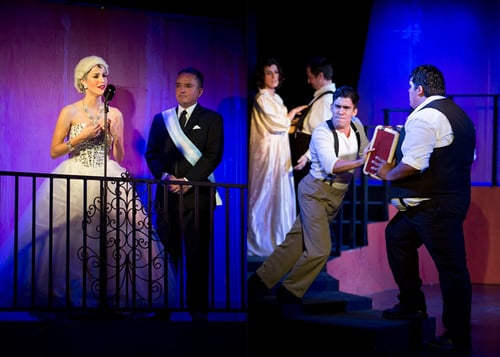 The looks became more colorful as we programmed. In many cases, strong reds, magentas, and blues from the LED's were necessary to emphasize themes like glamour or political conflict. I was pleased to see my gel colors working to create depth between the stage and the actors. If I had chosen anything different, anything more saturated, it would have appeared less authentic.When it all came together, I was very happy with the way it looked, and so was the director. It was a great collaborative effort to make such a power musical come to life.
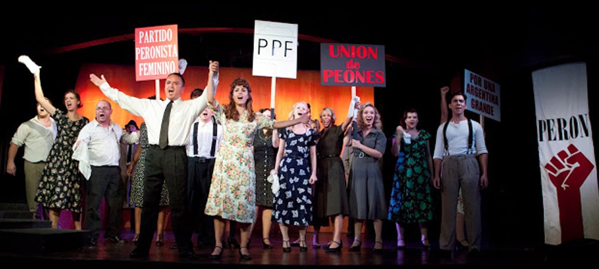
Photo Credit: Lisa Webb - SouthwestShots.com
Ryan Terry is the owner of Focal Point Lighting Design in Phoenix, Arizona. To see more of his work, visit his website or follow him on Instagram, which is where we found him.

