This Wavelengths post turns its attention to the color Blue and its current influence on Rosco and the world around us. Keep reading to learn about the 'Light it up Blue' campaign seen earlier this week in cities all over the world, one Roscolux color that is helping shape tomorrow's lighting designers today, how Rosco's Wendy Luedtke uses the SED curve to determine which blue she is going to use in her lighting designs, and an introduction to a new, yet borrowed, paint color in our Off Broadway line of paints.
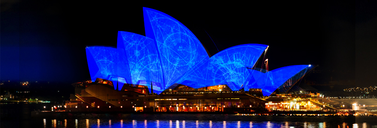
 April 2nd was World Autism Awareness Day and in a collective, global effort, cities across the country lit up some of their best known landmarks in blue as a part of their 'Light It Up Blue' campaign to draw attention to people within the Autism Spectrum. If you visit their homepage lightitupblue.org you can see some wonderful photos featuring azure buildings in Milwaukee, Chicago and Toronto and landmarks like Niagara Falls, the Christ the Redeemer statue in Sao Paulo, Brazil and the Great Buddha at Hyogo in Kobe, Japan. The two images I thought made the biggest impact were the Colpatria Tower in Bogata Columbia and Australia's Sydney Opera House. Those two examples really showed how the city's commitment to this cobalt-themed campaign ended up adding a sapphire jem to their skyline and drew extra attention to the event.

There are several campaigns throughout the year that include lighting buildings and landmarks in their own significant colors. The 'Light It Up Blue' campaign seems most successful to me - especially on a global scale. Perhaps it's because the lighting portion is the primary focus of the event, where other foundations seem to focus primarily on organized walks & runs or other fund-raising events while using the lighting aspect to promote those events. With the 'Light It Up Blue' campaign - the lighting IS the event and it seems to have captured the support of cities all over the world, including individuals' porch lights at home, because of it.
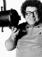
Another cause with blue at its core is the Gilbert Hemsley Lighting Programs. Gilbert Hemsley was a respected and loved artisan who designed lighting for numerous high profile performance groups around the country. Gilbert received instruction from the likes of Jean Rosenthal and Tharon Musser, which gave him a profound understanding of the importance of real-world, on-stage training for students in the lighting design field. Throughout his career, Gilbert often brought students with him, mostly at his own expense, to venues all over the country ranging from The Guthrie Theater in Minneapolis to The Mark Taper Forum in Los Angeles.
 To continue his legacy of educating students, the Hemsley Lighting Programs were created to offer master classes, portfolio reviews and, most importantly, a nine-month internship with professional lighting designers at the Lincoln Center Festival, New York City Opera and New York City Ballet. The intern is surrounded by theatrical professionals and immersed in all aspects of the lighting design process, including concept meetings, design presentations and technical rehearsals leading up to the live performances. The Gilbert V. Hemsley, Jr. Internship In Lighting is open to BFA & MFA graduates in lighting design. The deadline has passed for applicants this year, but for those who are graduating with their BFA or MFA in lighting design in 2012, it's a wonderful opportunity to immerse yourself in the professional world of theatre design.
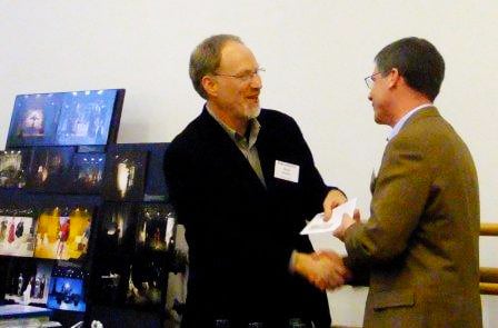 Rosco CEO Mark Engel presenting Rosco's contribution to the Hemsley Lighting Program from funds generated from sales of R361 Hemsley Blue, to Mark Stanley, at the Hemsley Portfolio Review.
Rosco has been supporting the Hemsley Lighting Program for several years with its Rosco Gives Back campain, by donating a portion of the profits from Roscolux #361 Hemsley Blue to the foundation. To date, the proceeds from R361 have generated nearly $16,000 for the program. The color was designed to the specifications of lighting designer Mark Stanley, who worked with Rosco to design a blue that he and Gil used to use on LEKO's but updated the color for use on modern ellipsoidals. R361 is not only a great blue that doesn't muddy as the light dims, but choosing to use it also helps support the future lighting designers of our industry.
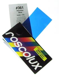
It would be great if R361 were the perfect blue for all stage performances, but the reality is all color is relative, and blue is a great example. Blue comes in all sorts of different flavors and helps convey so many messages. Call it simply "blue" if you like, but it can make the world appear red or green or even white. Blue can be luscious, electric, and trust this Minnesotan when I say it can be cold.
When Rosco's Color & Lighting Product Manager Wendy Luedtke shines light through the multiple shades & hues of blue in her Roscolux swatch book, searching out the perfect blues for specific moments in the production she is designing, she considers the entire range of the blue spectrum. Where does lavender or cyan end and blue begin? Some blues have a lot more red or green content than others. Wendy compares the SED curves of colors she's considering because "knowing the 'ingredients' in a particular blue helps me anticipate how it will render costumes and scenery, how it will play both high and low on a dimmer and how it will interact with the other colors in my palette. It's wonderful to imagine the possibilities these differences allow and to find the most resonant blue for each design."
Wendy's observations above deal with the saturation and hue in one spectral direction or the other with regard to lighting. Rosco recently borrowed a blue color from its Iddings line of scenic paints to fully flesh out our line of Off Broadway Paints. Introducing Off Broadway #5375 Navy, which doesn't so much address a need for a certain hue in the line, but rather, fills a need for a darker shade of blue.
 Off Broadway Navy
Off Broadway's blue line included a light Sky Blue, a clean Pthalo Blue and a bright Ultramarine Blue, all of which are intended to give a scenic artist vibrant, eye-popping color. What the line lacked was a darker shade of blue to create subdued scenery like Iddings #5573 Navy did.
The dark Navy blue allows a scenic artist to formulate moody shade colors, neutralize the color intensity of other blues without mixing in the complement and create darker scenic effects like thunderstorm clouds and gloaming night scenes.
Got questions on blue Rosco products? Well....
If you're blue
And you don't know
Where to go to
Why don't you go
Where fashion sits?
www.rosco.com

