

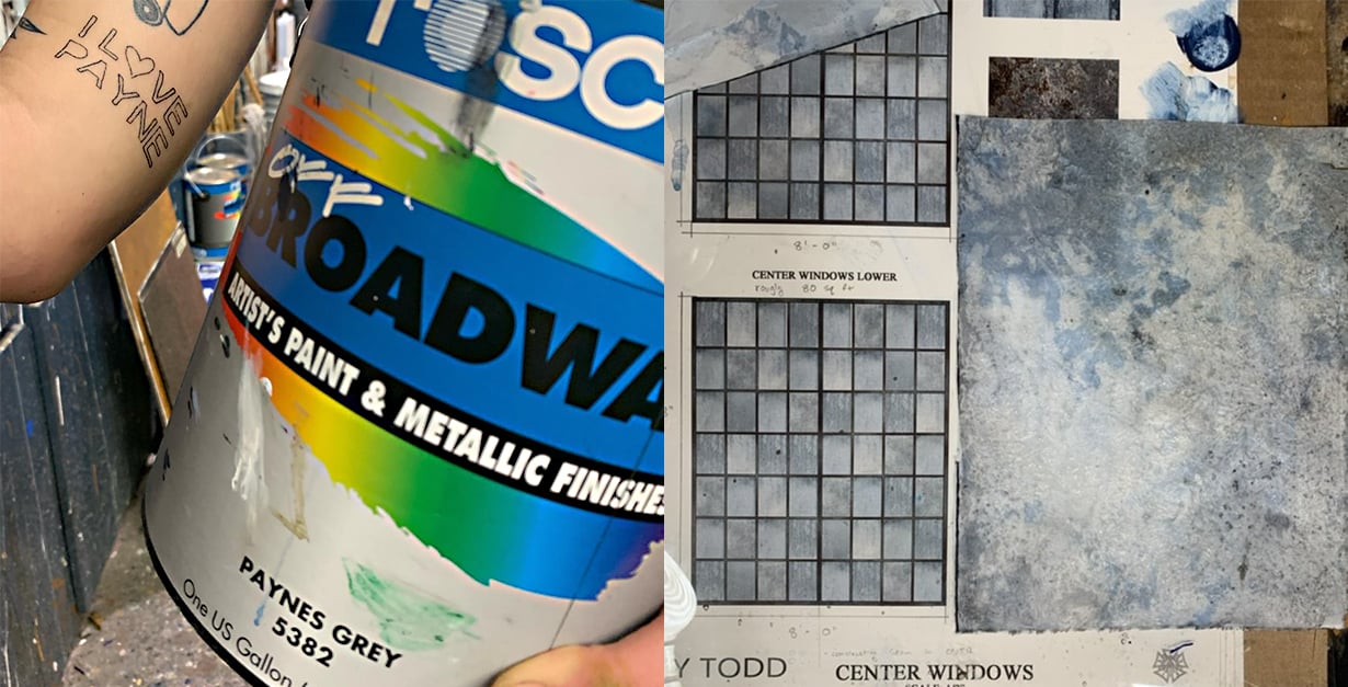
Rosco met Scenic Artist Annika Radovcich, the self-proclaimed “#1 fan of Paynes Grey,” at the USITT tradeshow in 2023. Her love for the color became apparent as she spoke fondly of it and showed off her “I 🖤 Payne” tattoo. Annika, who currently works as a scenic artist apprentice at The Julliard School, shares her experience with Paynes Grey below.
 Scenic Artist Annika Radovcich at USITT 2023.
About every scenic artist I know has a favorite paint color in the shop. Mine is, of course, Rosco’s Off Broadway #5382 Paynes Grey. Those who have worked with me know how much I adore this color! I can pinpoint when this love affair started. It was during my first summer stock – charged with painting a wood floor for the Mary Poppins nursery – when I got to crack open a fresh can of Paynes Grey. I used it in all of the colors for that wood and, feeling proud of myself, I declared that it was the color that made my world go ‘round.
My affinity for it is not unique to other Paynes Grey fans; It's deep, it's dark, it's mysterious, and it does almost everything black can do – but so much better. Paynes Grey is the perfect, all-around color. When mixed with white, it's creamy but cool – ideal for a lovely overcast sky, a cool slate, or a glowing moon! When simply watered down, its blue undertone shines through. Because of its relatively neutral nature, I find it extremely useful in both organic – natural elements, and architectural – “man-made” elements.
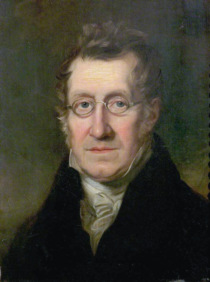 Portrait of William Payne – the English watercolor painter who invented the tint Paynes grey.
Let’s all thank William Payne, the guy behind the color. Mixing Prussian Blue (or Indigo, it’s debated), Crimson Lake, and Raw Sienna resulted in the original deep blue/grey Paynes Grey color. William was judged by other serious watercolor painters at the time for painting using a step-by-step, approachable process. Better described as using a wet brush for foliage, and the dry edge for hard, rocky surfaces… sound familiar? These are all techniques used to paint theatrical scenery.
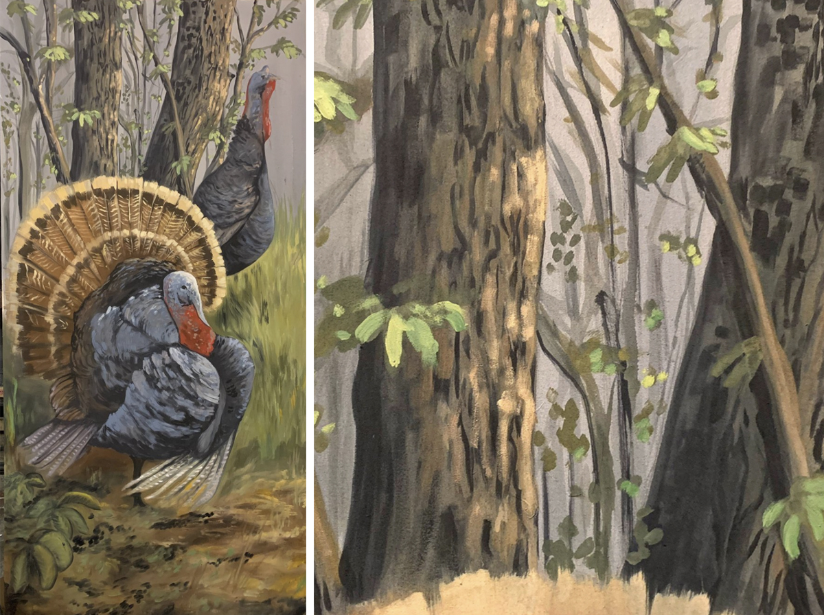 Annika’s turkey portrait for FranklinLand (L) and a closeup showing the Paynes Grey shadows (R).
In naturalistic applications, Paynes Grey is excellent for painting shadows. It's dark, but not harsh. While I don’t use it for grit and grime alone very often, it’s an outstanding player with Burnt Umber to create some serious dark, dynamic grime. I have found myself reaching for it and mixing it with a yellow-green to create deep, leafy foliage. I also used it almost exclusively for a turkey portrait in Curious Theatre’s Franklinland, where it was used in the bark, leaves, turkeys, sky, and shadows. It's a lovely addition to a moody sky, stormy clouds, and rocks.
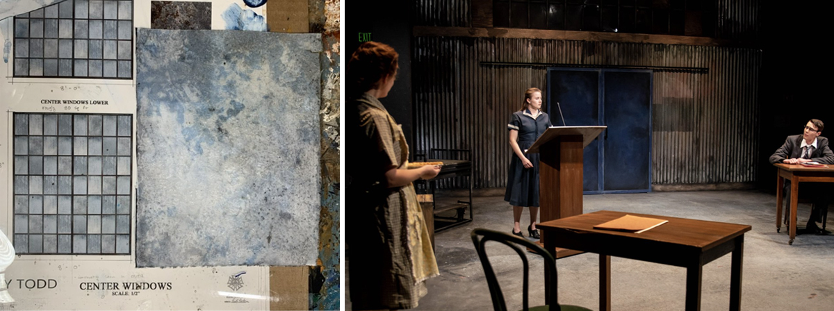
For more industrial uses, it’s extremely convincing. Paynes Grey is great for faux steel, a blue-tinted skyscraper in the distance, or the cool undertone of poured concrete. I have loved using it as a base for an otherwise light marble, letting it peek through in the light layers. If painting directly on a metal, it is an excellent tool for depth, as it plays to the tones already occurring. As seen in the painted windowpanes for Sweeney Todd (left), or in the airplane hangar facade for They Promised Her the Moon (right), Paynes is an industrial beauty.
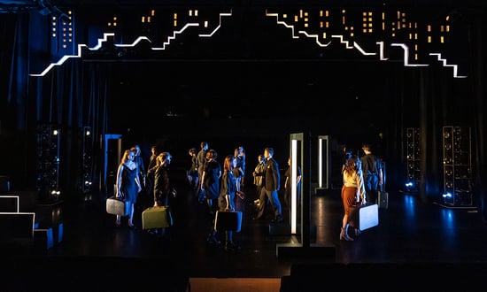
I find it useful in making pastels. Mixing white with a touch of Paynes Grey + Magenta produces a lovely dusty lavender or add Yellow instead for a lovely soft cool cream. You can also lean into the blue undertones and mix it with Prussian, Sky, Pthalo, or Ultramarine Blue for a variety of moody blues. It’s also, in my opinion, a very sleek, modern, clean, deep color, and an interesting replacement for black. In the photo above, you can see how I used it as *the* color for a production of Company.
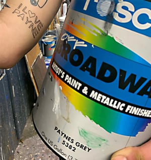
All in all, Paynes Grey allows for unlimited creativity and it’s a necessary addition for all scene shops. I take pride in being the #1 Paynes Grey fan and, if you aren’t already convinced that I am, I recently got a minorly impulsive tattoo declaring my love. I will always use this color, and I truly believe you should too.
You can learn more about Annika’s work on her website: www.radtheatrics.com, or follow @rad.theatrics on Instagram. If you would like to learn more about the paint Annika loves, visit the Off Broadway Product Page on the Rosco website.
Brittney Pecor September 28, 2023 Questions?

Prior to joining Rosco in 2018, Brittney worked as a lighting technician and light board operator in a variety of theatrical and concert venues. In her prior role as a Project Manager for our Rosco Architectural division, Brittney gained extensive knowledge of our architectural products as she built relationships with our customers. Her background in Live Entertainment and her experience with Rosco’s architectural products make Brittney a valuable resource for technicians and designers around the world.